About the exhibition
In 2016 I was invited to be part of an exhibition called Palimpsest, held in The Old Chocolate Factory in Bad Oeyenhausen, Germany.
The exhibition was curated and organised by Katja Rosenberg and Artcatcher with the aim of raising money to support multilingual guided tour for citizens with a migration background.
The theme “Palimpsest” means from old, make new. It also has the practical meaning associated with old drawing and writing materials, where ink etc was scraped from velum to allow it to be re-used.
“In the context of our town and current world, we mean the process of redefining the purpose of a place in an ever changing world with its changing challenges and opportunities – the essence of the place stays visible, but its thinking has to change with the times.” (Katja Rosenberg, 2016)

As the exhibition was held in a building destined for regeneration by a local architecture firm, this was particularly salient.
All works entered were the same dimensions (30x120cm portrait), and installed hanging from the interior ceiling of the building, allowing visitors to walk between the works. In addition events and dance performances were held around the work during the exhibition.
About the work
“Room for growth” Ink on rice paper.

Artists statement:
“We construct a building with one original purpose in mind. A generation invests in the maintenance of the building until it falls into disuse, or evolves its usage and meaning for the next generation.
In this work, we see a building which has multiple simultaneous uses, with inhabitants finding many ways to benefit from the structure. This building is a hive of activity – representing the ever-changing ecology of a building as well as the dual influence of both man and nature.
The artwork is constructed of layers of rice paper and maps of the Bad Oeyenhausen area containing the old Schokoladenfabrik building, which are visible beneath.”

About the process
For this piece I was inspired by the format (120cm portrait), the location and the concept of Palimpsest – which aligned with my ongoing interest in architecture and the relationship between people and the buildings they inhabit, particularly when those uses and facades change and grow together.
With the requirement for a long work, I wanted to work with a continuous sheet of paper of an appropriate size. I also wanted to include a map of the local area in which the exhibition and the tours would be held.
Therefore I combined a long sheet of rice paper with maps of Bad Oeyenhausen to allow both to be shown without impacting on the surface work itself.

It was also particularly relevant as I had recently been exploring cartography as art and drawing, as part of my studio work.

First, I had to test my hypothesis that by drawing on rice paper, enough of the map would be visible beneath


I created some practice drawings using Derwent Grafik pens as an initial experiment.
It actually created a nice balance with the relative opacity of the paper, so that there was an impression of the map behind, without obscuring or over-complicating the illustration on top.
When working with the rice paper, I soon realised two things.
- You cannot use pencil. Or at least, you cannot erase pencil, as it destroys the paper. Therefore you need to draw in ink first time, and you have to get it right.
- The ink bleeds massively into the paper, especially if your drawing uses slow and methodical marks, rather than broad light gestures. So whereas on standard drawing paper I might use Derwent Grafik pens to provide a little more movement and fluidity (because my lines are slow and methodical and can look a little rigid), when working with rice paper I needed to use drawing pens with more control.

Note: for more info on these differences between drawing pens, check out my very very long materials review on the Jacksons Art Supplies blog.

Here you can see how I experimented with different pen sizes for different features in the architecture, working out which nib size of which drawing pen brand I would need to replicate the effect I’d expect on standard drawing paper.
In the end I settled on a combination of Unipin and Sakura Micron Pigment markers of various sizes, and used this as a constant guide as I developed the final work.
In order to work at this size, and fully understand the dimensions with which I was working, I pinned the full length map to a roll of fabriano drawing paper and taped it to my studio wall.

And because, as previously established, I only had one shot to draw this directly in ink, I basically had to pre-draw the framework on an identically sized piece of paper and copy across.

Here’s the final work.



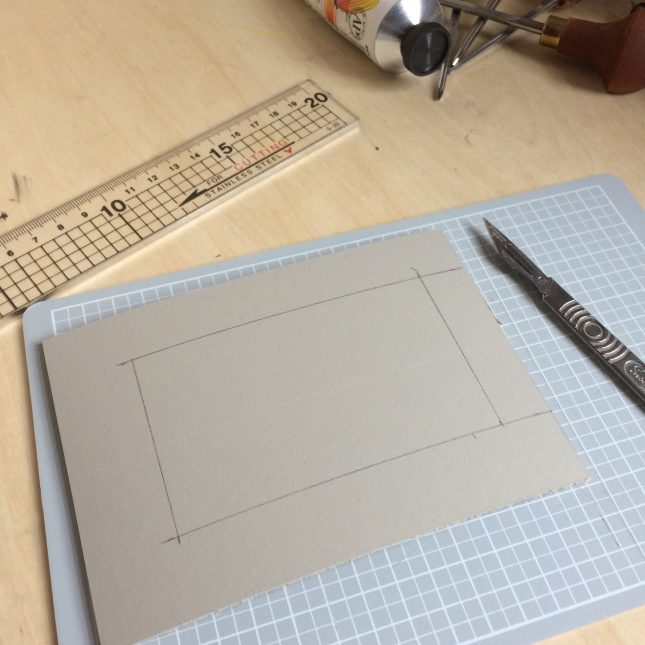


 I admit, I freaked myself out a little too.

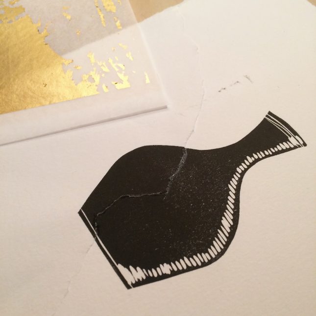
 Bit more careful with the glue this time..
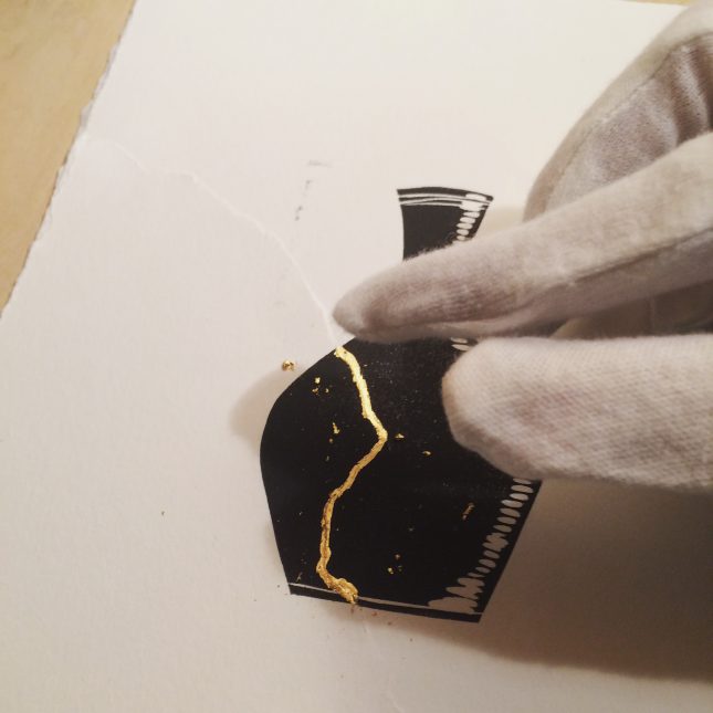 And of course I remembered to wear gloves to avoid tarnishing the gold with my human hand oils 😉
 And there you have it.


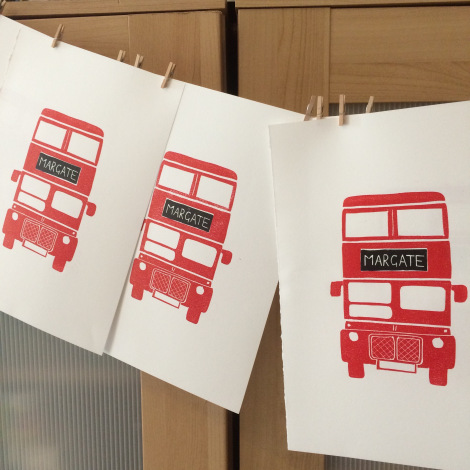


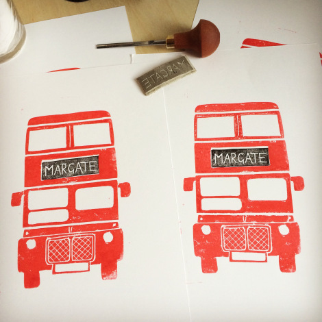

 The first reveal of the second (black) plate… thank gawd I didn’t mess that bit up.
