Big update today, as I’ve now got the first 50 images edited and laid out. Notwithstanding some major issues with scanning, photographing and editing some quite nuanced watercolour work, I feel like I’m finally getting somewhere!
What’s in a name?
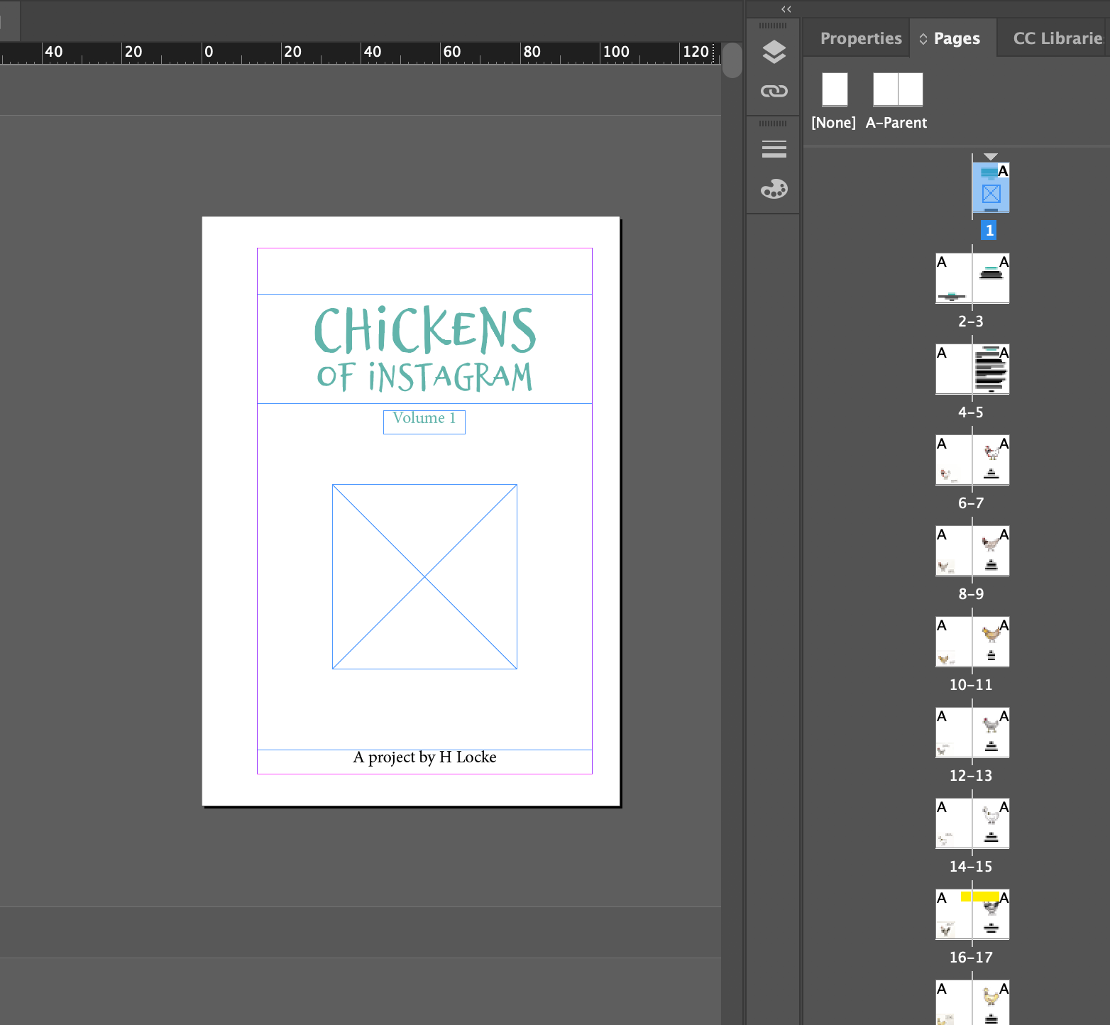
One major update however has been the front cover – as I’ve decided not to name the book after the instagram account (@nevertoomanychickens) but rather after the purpose of the project – To draw the chickens of instagram.
And so, I give you…
Chickens of Instagram (volume 1)
I ended up in a bit of quantum entanglement on this one.. will people know it’s the instagram project if I change it? But will it make any sense as a title? (especially as I’ve had notebooks, stickers and all sorts on etsy for ages using the same title, and with different fonts..)
But I finally settled because well, it does what it says on the tin. And with the “volumes” approach – it will keep me going with the project which was to keep drawing.. the chickens of Instagram.
VOTING
So the next question, obviously, is who is going to be on the cover?!!!
To decide this, I am open to comments, messages and voting on the channel of your choice – you can:
• Comment on instagram
• DM on instagram
• Comment on here
• Send me any other kind of electronic communication of your choice.
I’ll publish the result as the front cover.. when it’s gone to print! 😅
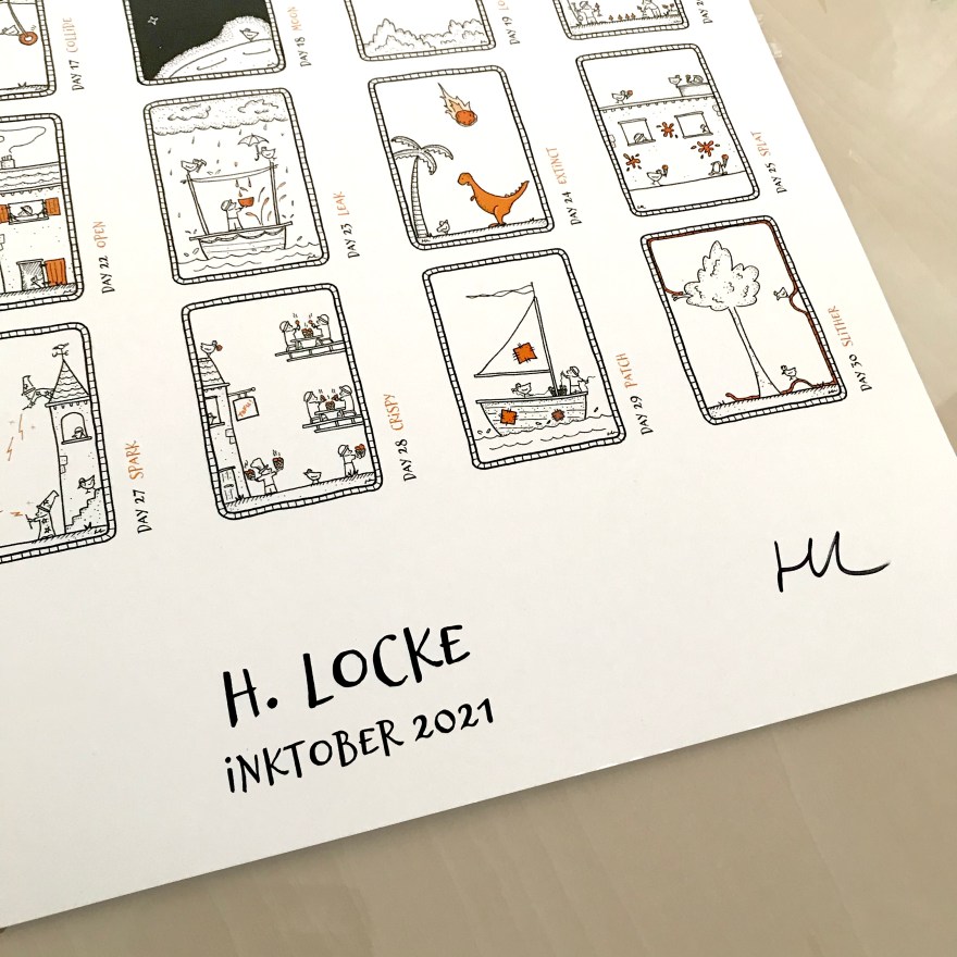
Well it’s finally time, and I’m going to start putting together the first volume of “Never Too Many Chickens” – a book based on the Instagram art project I’ve been running for the last 2 years.
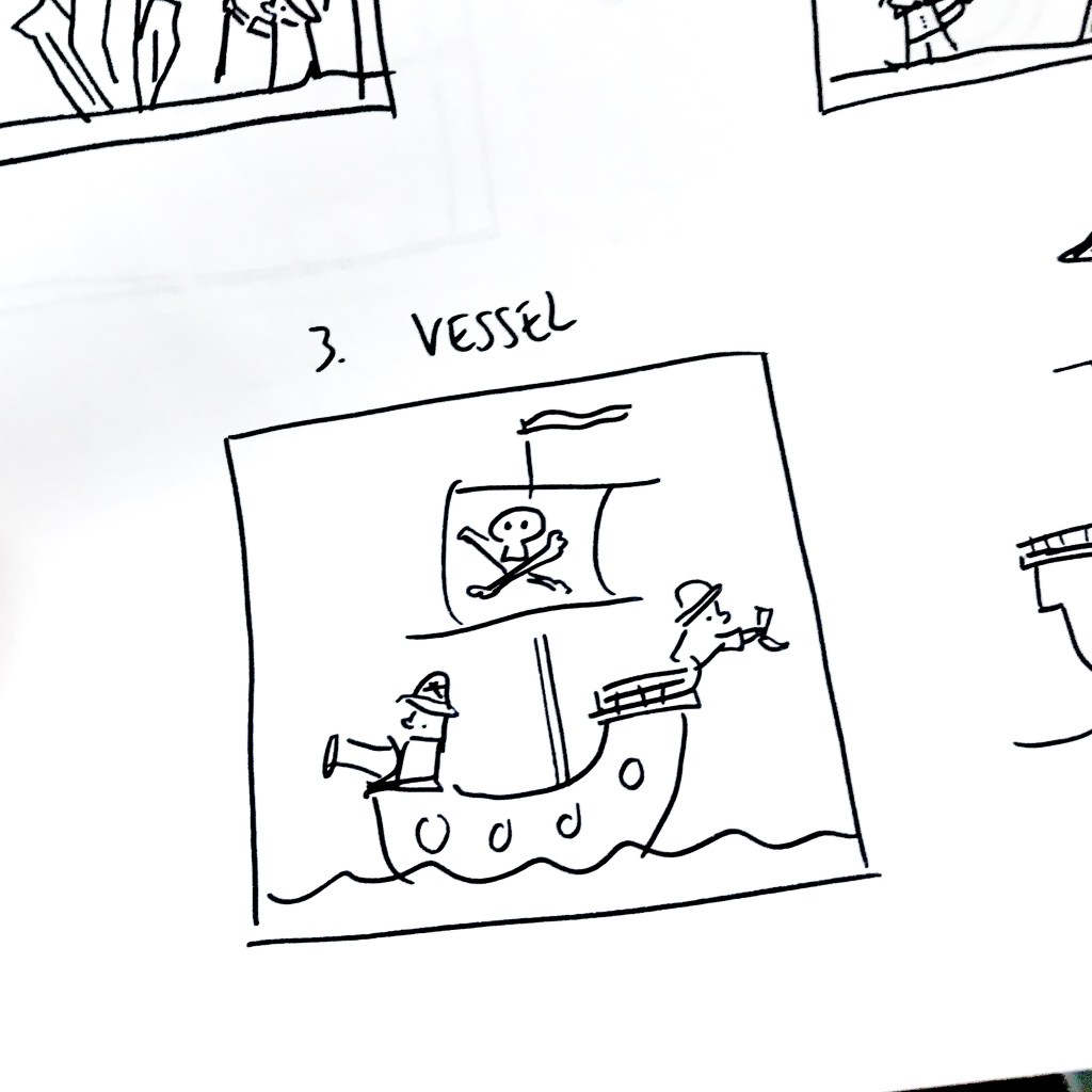
This started in Feb 2020, right before the first UK lockdown, where for some reason I decided it would be a fun challenge to draw the various Chickens on Instagram, with their own accounts or featured on their owners (..parent’s..?) account.
The premise was that anyone with an account could nominate their own chicken, provide their name and I’d add them to my list.
List became very long very quickly. I also found it went out of date fairly often, so I had to keep re-asking for recommendations and permissions!
I’ll do a full project run down at some point in the future, but for now, here are some pics of my initial set up – as I take hi-res images of the originals, plus a short video because Fun!
Here I’m using the IPEVO V4K high definition usb camera, which I have attached to my MacbookPro. This is an upgrade to the basic iPhone photos I’ve been taking for the Instagram account, so should hopefully produce something usable for publishing.
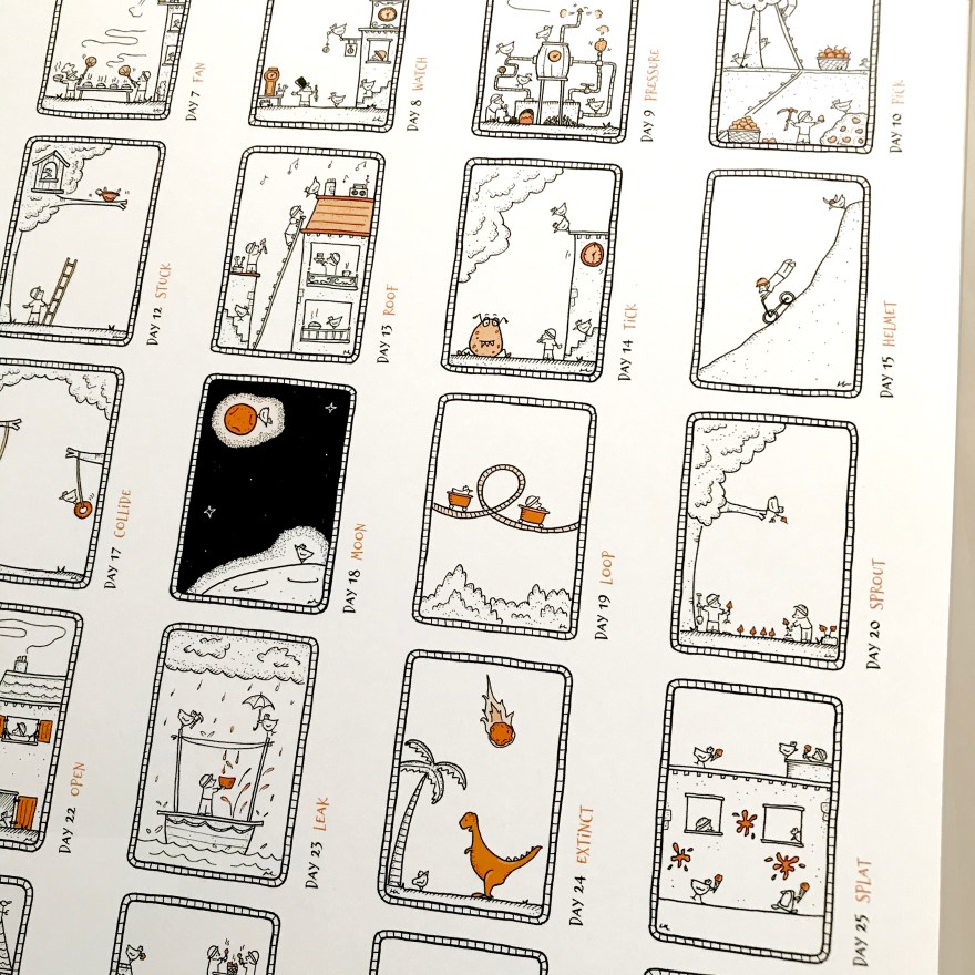
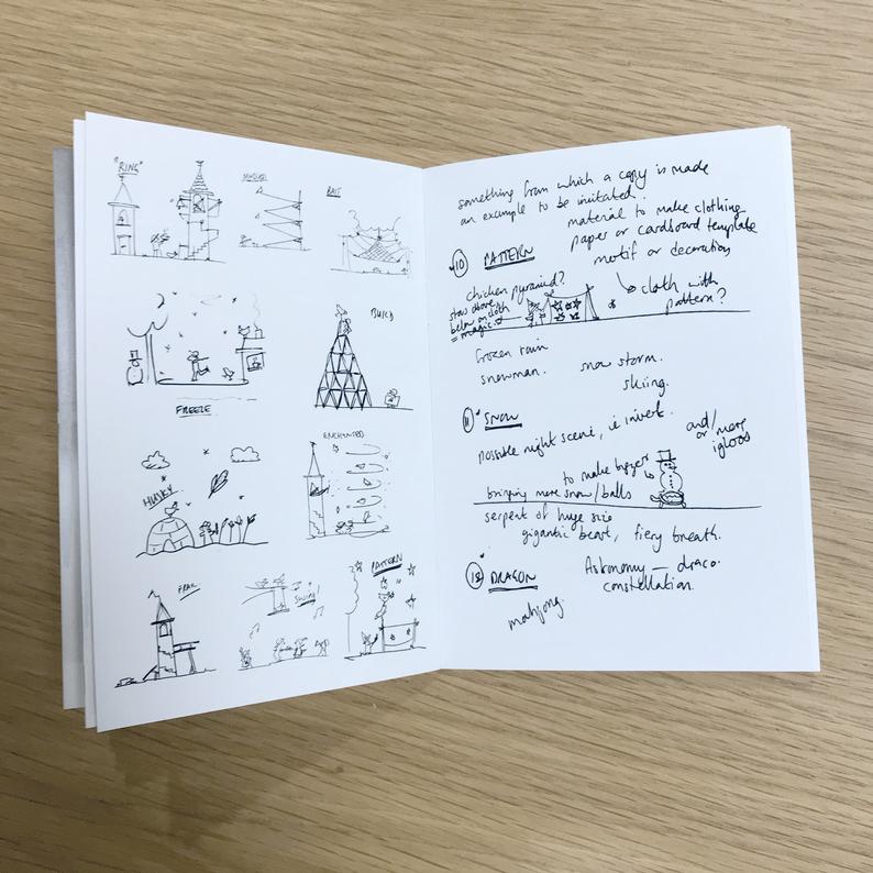
I tried to be a bit prepared for this year’s Inktober, but as usual it came with its share of unexpected challenges.
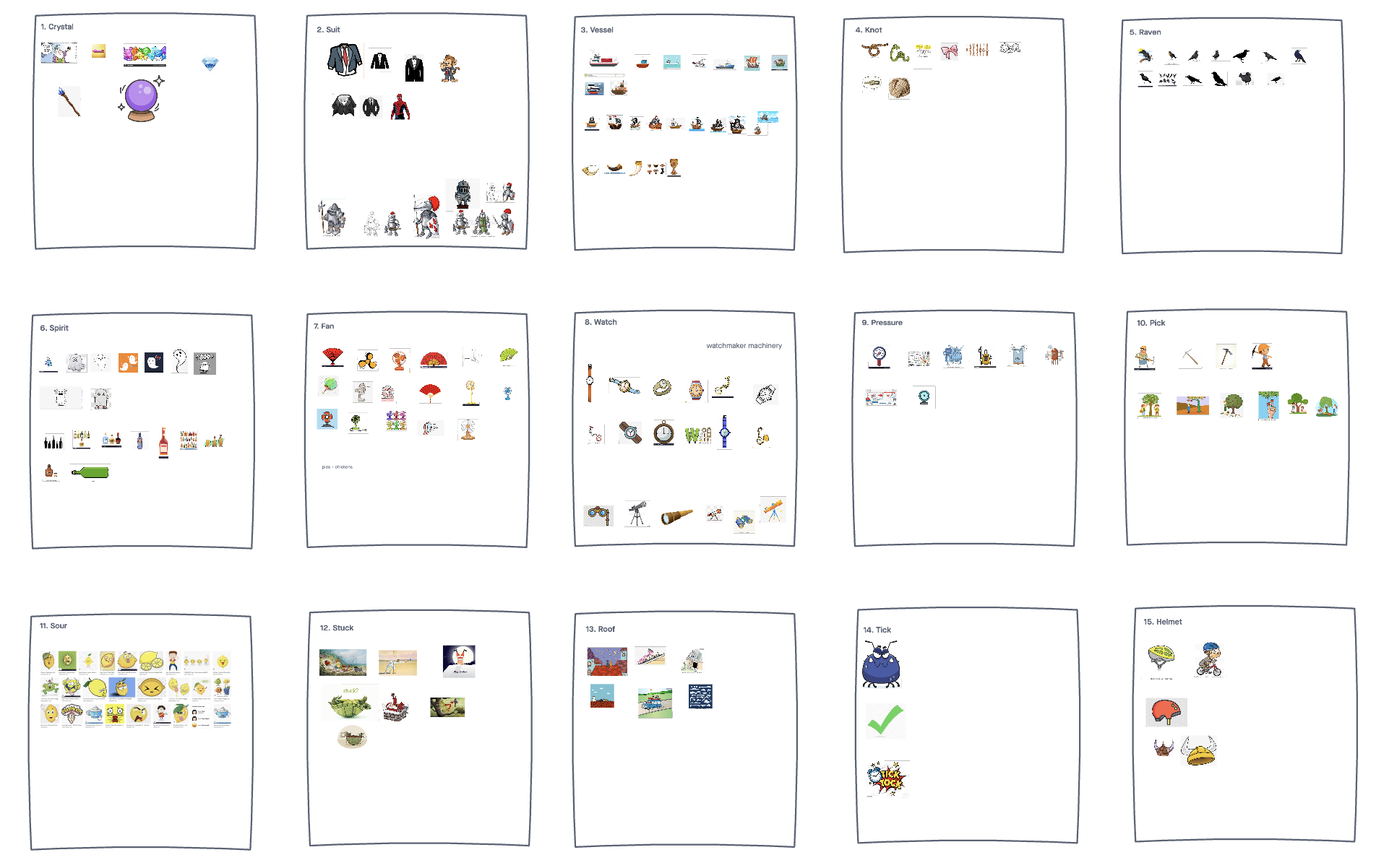
Preparation
As in previous years, I tried to have a bit of a think about the prompts before the day itself, mostly by creating a sort of mood board of inspiration for each word.
Launch
I was extremely excited to start this year’s Inktober, especially as I’d not been very active on Instagram for a while (Covid, busyness etc) so of course it was an extra challenge that I was immediately blocked by Instagram for two weeks for no reason and with no way to appeal.
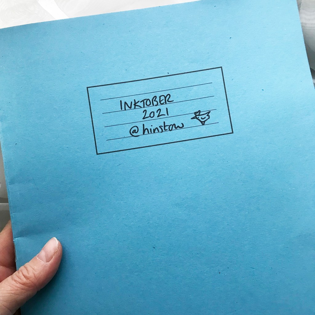
So, I launched Inktober on TikTok, Twitter, Tumblr and Pinterest instead.
Keeping up
As far as each day’s drawing, I used one of my standard exercise books to draw one or several preliminary sketches for each prompt.
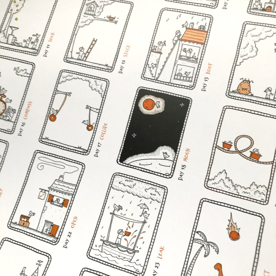
For this year’s final output I made an A3 poster of all the drawings on one sheet. I was really pleased that the dark image (Day 18 – Moon, which is the most dominant) fell in the middle of the series.
A recent commission titled: “Delivery Bike” (SOLD) Ink on paper.
I often get questions over on Instagram about what I use and how when making my ink drawings. So that’s what I’m going to cover today!
Method
It’s probably important to know the “what I am trying to do” before any of the materials decisions make sense!
Pencil or no pencil?
The most frequent question I get asked is “where are the pencil lines?” Well that’s simple – I don’t use pencil. Not sure why, but I’ve always just gone straight to ink. I think it might originally have been laziness, or a dislike of the way most erasers damage the richness of the ink, or it might have been to stop myself over-thinking everything I draw!
Probably all of the above.
Straight to ink. No pencil, no safety net.
Materials
For black and white line drawing, I basically only use two things – pen and paper. I like to keep it simple, which I think is reflected in the work! Also, the fewer materials I have to carry round, the less set up – and this means I’m more likely to sit down and draw something wherever I am, rather than need some elaborate set up.
This is particularly useful at the moment, when I’m living between cities and without a single large studio to work in.
Pens
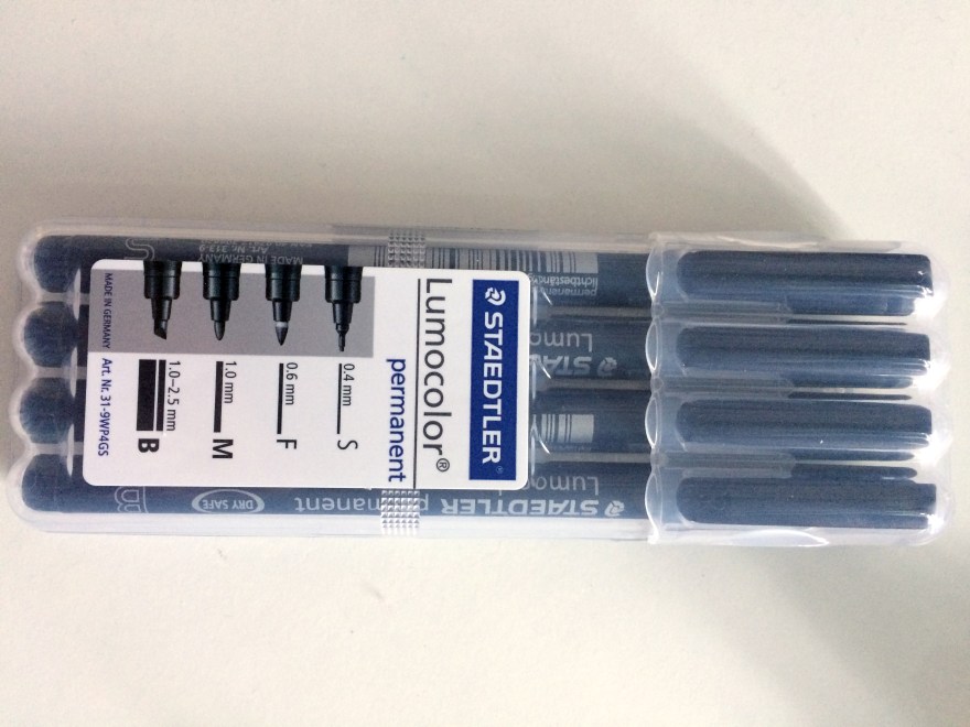
The most important thing for me is pigment ink; the work has to be light-fast. Also, I prefer pens that are waterproof as it reduces the chance of smudging, especially on a hot day!
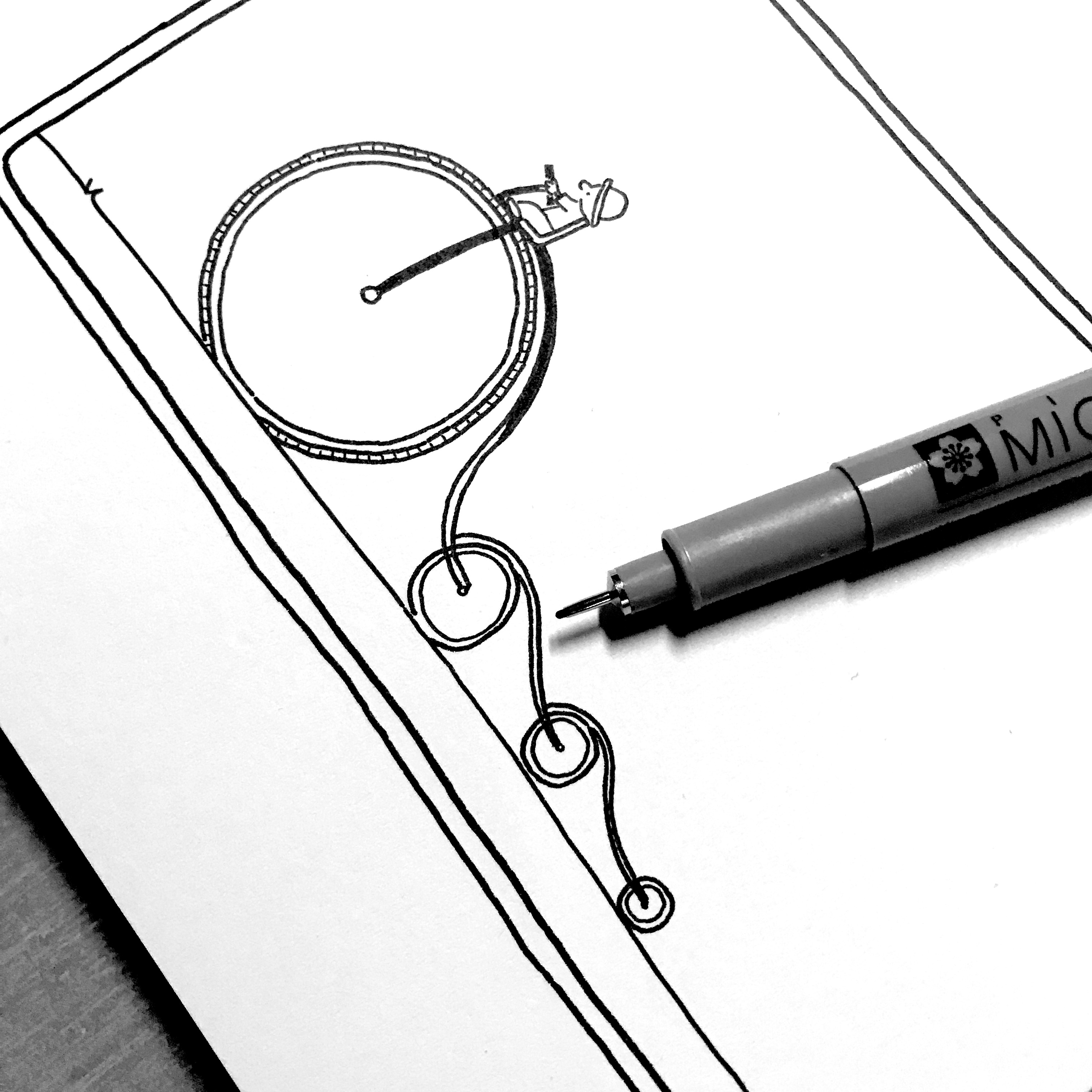
#1 Sakura Pigma Micron Fineliners
My go-to pens for many years now have been Sakura Pigma Micron Fineliners. I have a standard 6 pack in every drawing bag and case I have, but you can see the full range here.
I used them through Inktober 2020 and I still use Derwent Graphik Linemakers for my project @NeverTooManyChickens. I can’t remember why I didn’t use the Microns – it might have been that I didn’t have any to hand, or someone had given me these to try, but now it’s a habit I can’t break.
Part of me wonders if they feel slightly more robust when drawing on watercolour paper – that’s the only thing I can think of.
#3 Unipin
Unipins were the first drawing pen I ever used, and so they have a special place in my heart. I also still believe that their 0.05 is the finest out there without investing in the inky mess of Rotring Rapidograph.
#4 Molotow Blackliner
A late addition to my suite of pens is the Molotow Blackliner – but oh my these are delicious. I think I was gifted some to try and fell in love. They are really dark black and flow really well. I used them for my entire book The Wizards of Cattywumpus because they were just a joy to use. A little harder to control the ink flow, so I still stick with my Microns for day to day use, but I adore these.
Paper
Ok, so paper is tricky because.. “it depends”.
In general, these days I use sketchbooks not sheets or pads. But there are some exceptions:
Commissions – need to be on a single sheet so that I can work for a long time on a flat surface, and then send the single item out to someone
Books – I tend to do the artwork on sheets of marker paper because I know they will be scanned and turned into digital work – never sold as originals and therefore don’t have to be high quality rag paper
@NeverTooManyChickens – all on hot press watercolour paper, because well.. I’m then painting them with gouache
But for day-to-day use I tend to use sketchbooks because these days, the paper quality is excellent and I if I can manage to carry the same sketchbook around for a period of time, I tend not to lose them all!
Features of a sketchbook
I’ve been using them for a few years now, so I’ve ended up with a clear set of preferences:
1. Paper has to be thick
Generally, I need paper to be of a reasonably heavy weight. This is because I don’t want my beautiful dark pigment ink to soak straight through, and because I may get asked to sell a drawing and so I need it to be of a high quality outside of the sketchbook.
2. Paper has to be smoooth
I don’t know where this comes from, but I’m generally not a fan of bumpy paper. It makes the lines wiggly and generally life a lot harder than I want it to be!
3. Covers have to be hard
I used to use all sorts of sketchbooks, but with extensive travelling, I now prefer sketchbooks with a hard cover and a band around them, so that I can chuck them in a bag or case without too much worry that they’ll get squished
4. Paper usually has to be white
I prefer very white paper. Partly because I just prefer pure black on pure white, and partly because it’s so much easier to take photos for Instagram!
My go-to sketchbooks
So, the sketchbooks that meet the above criteria, that I use all the time are:
Stillman & Birn Zeta – I mean the whole series is to die for, but they hard hard cover and spirals which makes life super-easy. And the paper is the smoothest and whitest I’ve found. Heaven.
Moleskine hard covers – I used to use these all the time, but the paper is a little lightweight and usually a little cream/yellow unless you buy the watercolour/drawing paper versions. These will still do for me in a pinch, especially working with Microns because the bleed through isn’t too bad. It’s good that I can grab these at an airport for example, if I have failed to plan ahead properly!
Royal Talens – This is what I’m using the most at the moment. These were given to me and I was hesitant at first – because I didn’t choose them(!) and because the paper is not quite white – it’s a little off-white or almost cream. Also not as smooth as the Zeta. But for reasons I cannot quite put my finger on, I’m really enjoying them.
I think perhaps because the paper has a really nice weight to it, and the cover feels high quality and extends nicely beyond the end of the paper. Also, despite being a white cover, I have thrown them in and out of bags with no damage or marks either to the cover or the pages inside.
What else? (a cheat)
One more question I get is “how do you draw such straight lines?”
There are two answers to that:
a) Practice
b) Cheat
In most of my sketchbooks, I keep pre-cut pieces of paper, or even post it notes!
Top tip: when using guides that you inevitably store in the back of your sketchbook, a thicker sketchbook paper like Talens, rather than that of a Moleskine prevents any impact through the paper you’re drawing on. Most of the time I don’t use guides, but when I’m doing something like Inktober and I want all of the cartoon panels to be consistent – that’s what I use.
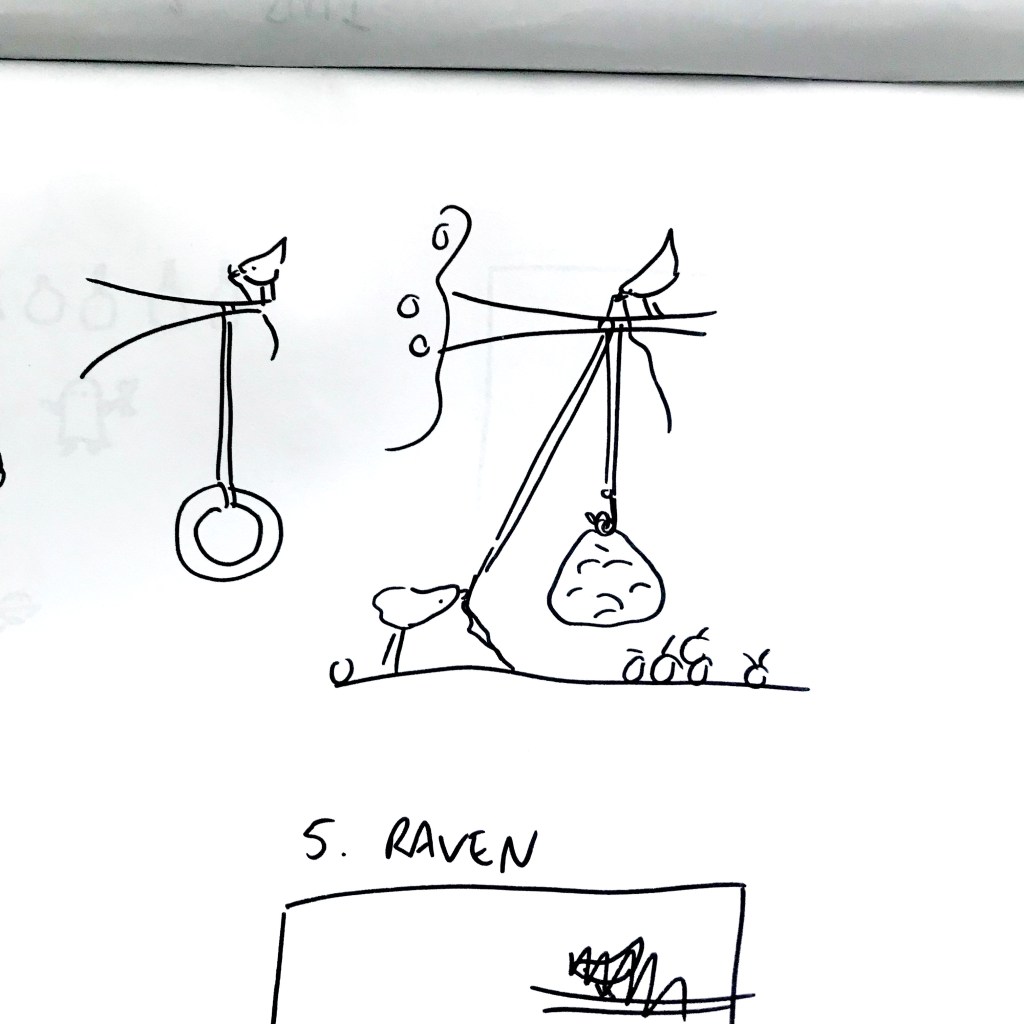
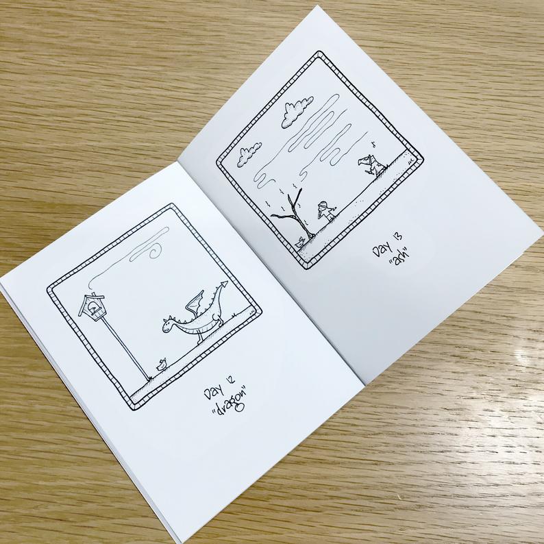
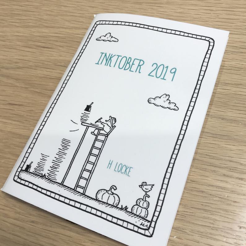
In October 2019 I took part in the instagram drawing challenge of Inktober. I’ve done it a couple of times before, but generally found that I don’t have enough time to dedicate to coming up with really good responses to the prompts.
This year, I committed a lot of upfront time to researching the semantics of each word, and trying to come up with really creative solutions. As I was happy with the outcome, and received a lot of messages asking about my process, I decided to publish a book of the drawings, along with pages from my sketchbook and photos of my materials and the approach I took.
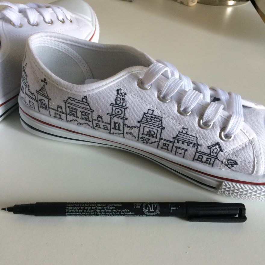
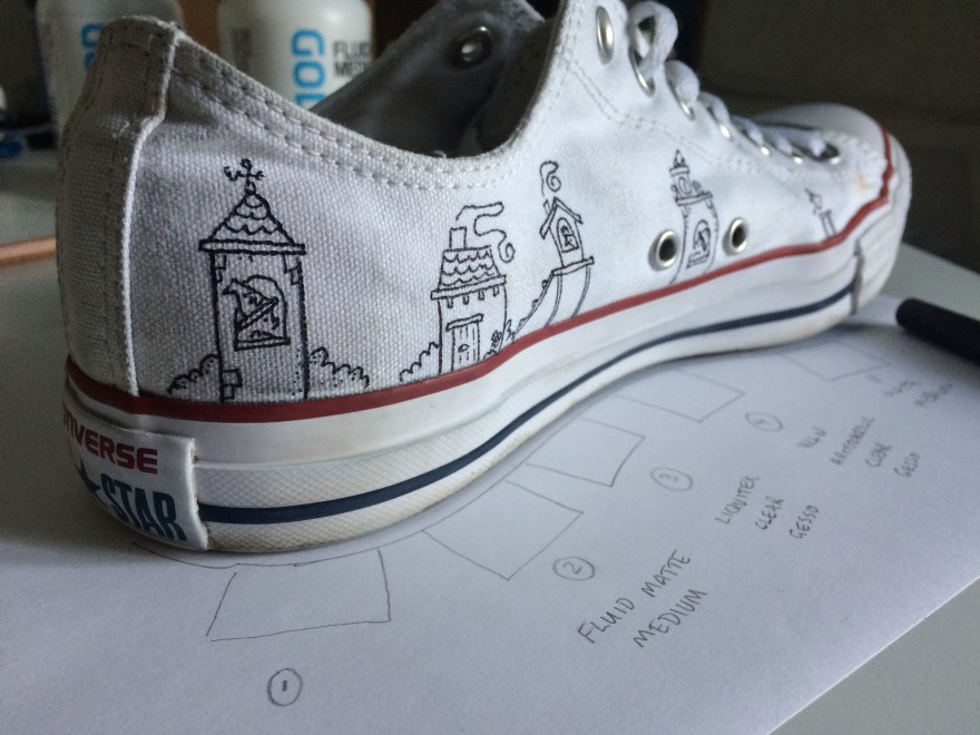
I have recently been experimenting with drawing on trainers, specifically; white Converse (or cheaper alternatives!). Although most of my work is ink on paper, I also enjoy branching out and seeing what materials allow me to draw on other surfaces such as walls, plastic, windows or even eggshells.
Initially, I tried both Sharpies and fine line permanent markers on old converse (grey) and cheap white canvas sneakers.
As you can see, although not dreadful, there is some bleeding into the material. The permanent markers gave me far more control than sharpies, so those were definitely the right pen – but how would I get the line to be crisper and cleaner and more like my work on paper? Especially as I wanted to move on from cheap canvas shoes to real Converse – and you don’t want to mess those up at £40+ per pair.
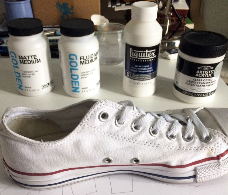
So, as with all things art supplies, I asked my friends at Jacksons Art what they’d suggest to help prime this kind of canvas so that I could create a cleaner line effect.
The recommendation from Jacksons was to experiment. Helpfully, they suggested 4 different types of primer that might work. And so the experiment began.
***
The following is an arts materials review. No doubt, I am not using the materials for their intended purpose and therefore apologise to the manufacturers if I am in any way criticising their products – I’m just trying to find a hack that works for this purpose.
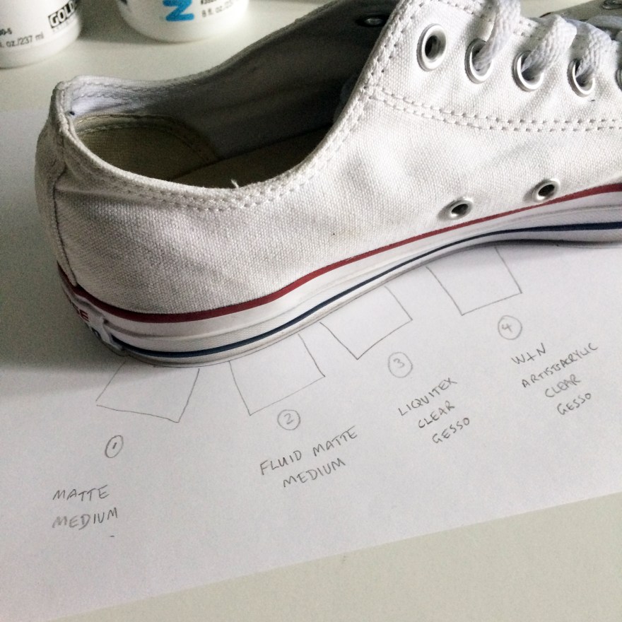
Next, I took a Converse sneaker (this was actually my own pair of size 8s that I was testing..!) and marked out 4 squares for the test.
I then applied each medium/gesso to the patch of canvas directly above, let it dry, assessed the effect, then drew on top to see how the permanent marker interacted with the gesso.
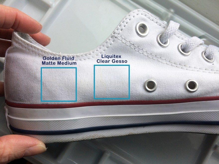
Findings – impact of gesso on canvas
What I was looking for was a light gesso, that wouldn’t make the canvas too stiff, wouldn’t remove the texture of the material, and wouldn’t darken or dirty that brilliant white.
Golden Matte Medium
This one had the biggest impact on the material in that it darkened it considerably, even when dry. This picture is of the heel of the shoe which I thought might have contributed, but I did another test near the toe and it did the same thing.
2. Golden Fluid Matte Medium & 3. Liquitex clear gesso
These two were probably best in terms of impact/effect on the canvas – they neither left dark stains, nor were so thick that they obscured the texture of the canvas.
4. Winsor & Newton Clear Gesso
This one came out the thickest, obscuring the most of the canvas texture. Unlike the Golden Matte Medium, it didnt darken the material and kept it nice and white, but it almost looked like a thickly primed painting canvas.
Findings – drawing on gesso
For the next stage, once the gesso was dry I use the permanent marker to create some sample drawings.
Note: if you see someone with partially drawn on white converse, that will be me..
Golden Matte Medium
This didn’t work for me. It felt like I was drawing on hard lumpy plastic or hardened glue. You can probably see from the way the roof of the turret is bumpy where I lost control of my pen on the uneven surface. Control is absolutely paramount to me so this, combined with the darkening effect puts this gesso in last place for me in this test.
2. Golden Fluid Matte Medium
This one was much easier to draw on than the Golden Matte (non-Fluid), but still felt a little bit scratchy compared to the next.
3. Liquitex Clear Gesso
The thing I liked about this one, was the ease of drawing (i.e. smoothness), compared to the level of detail I could achieve.
4. Winsor & Newton Clear Gesso
Remember, this is the one that went on thickest and removed the texture of the canvas. It was relatively easy to draw on (because it had smoothed out the texture underneath) and the black seemed to look blacker as a result. However, for some reason it seemed that I couldn’t get the same level of detail as the Golden Fluid Matte Medium and the Liquitex Clear. Take a look at the hat in the drawing, and the way the lines are almost blurring together.
Conclusion
I’m keeping the Golden Fluid Matte Medium and the Liquitex Clear, and would definitely buy both in future for this purpose, depending on what I could get my hands on. However, I’m starting with the Liquitex on all my current projects and commissions.
Now check out the difference between primed and unprimed – the expensive blimmin failure that was this pair of baby/kids Converse!!
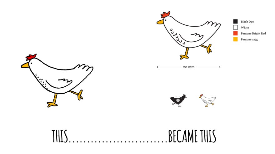
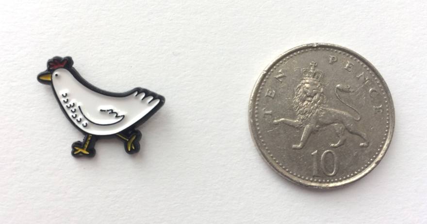
As an experiment, I recently turned one of my cartoon characters into a physical badge or pin. This was new for me, as most of my work stays resolutely 2D, with the exception of that series of eggshells back in 2014. So I guess it’s only appropriate that the character I chose to transmogrify was a chicken.
I’ve been drawing chicken characters for a while. They first showed up in a series of single panels cartoons which I was doing to entertain myself on Instagram.
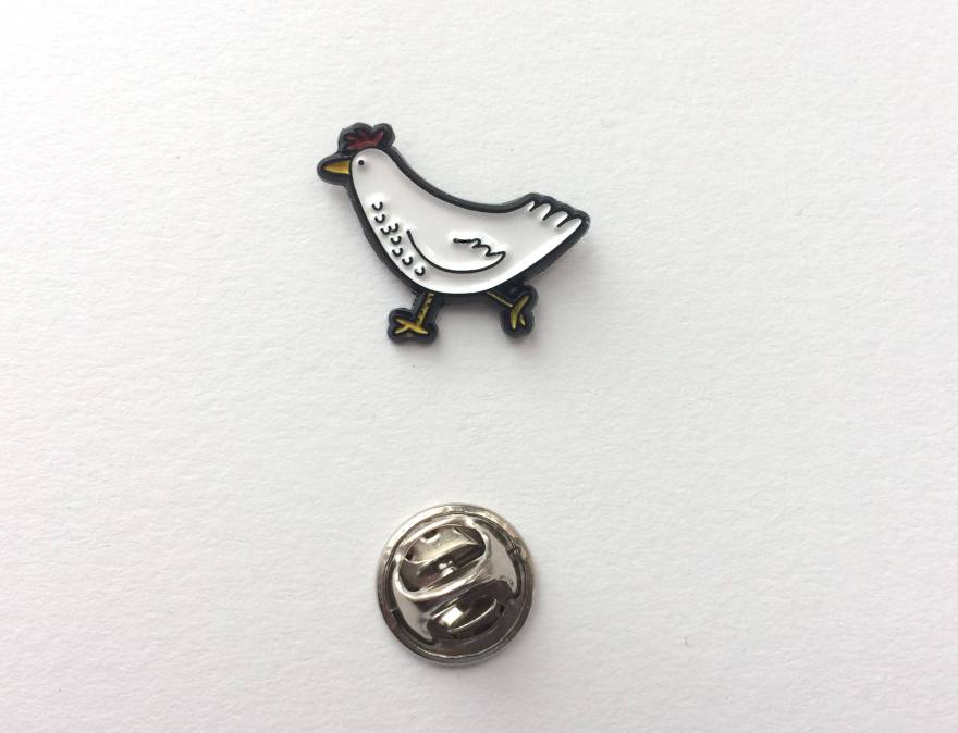
I took one of my digital drawings with a bit more detail and submitted it to Cooper to be made into a pin.
I think they did a really nice job with the artwork, but it makes me realise how much cleaner my line work has to be if I want to make more enamel badges in future.
Although it took a very long time to receive – compared to my 2017 amazon level expectations.. I think you’ll agree the final results are pretty darned spectacular.
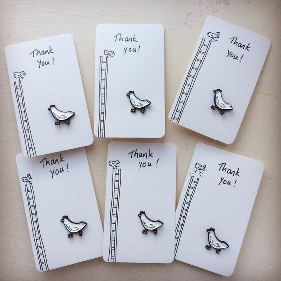
I’ve also been very excited, since putting them on to Etsy, to discover a fan base for all things chicken in lovely Mexico. It was definitely a surprise to wake up to a load of orders in Mexico City!
I’ve had great fund packing them up and thinking of presentation concepts such as these little hand drawn cards.
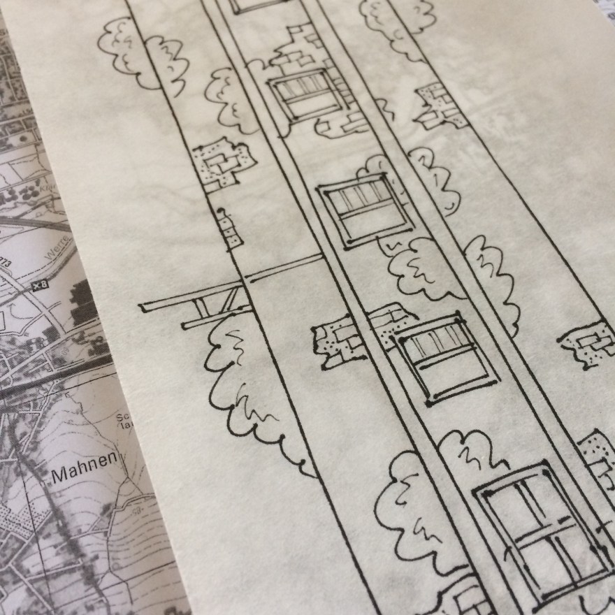
In 2016 I was invited to be part of an exhibition called Palimpsest, held in The Old Chocolate Factory in Bad Oeyenhausen, Germany.
The exhibition was curated and organised by Katja Rosenberg and Artcatcher with the aim of raising money to support multilingual guided tour for citizens with a migration background.
The theme “Palimpsest” means from old, make new. It also has the practical meaning associated with old drawing and writing materials, where ink etc was scraped from velum to allow it to be re-used.
“In the context of our town and current world, we mean the process of redefining the purpose of aplace in an ever changing world with its changing challenges and opportunities – the essence of the place stays visible, but its thinking has to change with the times.” (Katja Rosenberg, 2016)
As the exhibition was held in a building destined for regeneration by a local architecture firm, this was particularly salient.
All works entered were the same dimensions (30x120cm portrait), and installed hanging from the interior ceiling of the building, allowing visitors to walk between the works. In addition events and dance performances were held around the work during the exhibition.
“We construct a building with one original purpose in mind. A generation invests in the maintenance of the building until it falls into disuse, or evolves its usage and meaning for the next generation.
In this work, we see a building which has multiple simultaneous uses, with inhabitants finding many ways to benefit from the structure. This building is a hive of activity – representing the ever-changing ecology of a building as well as the dual influence of both man and nature.
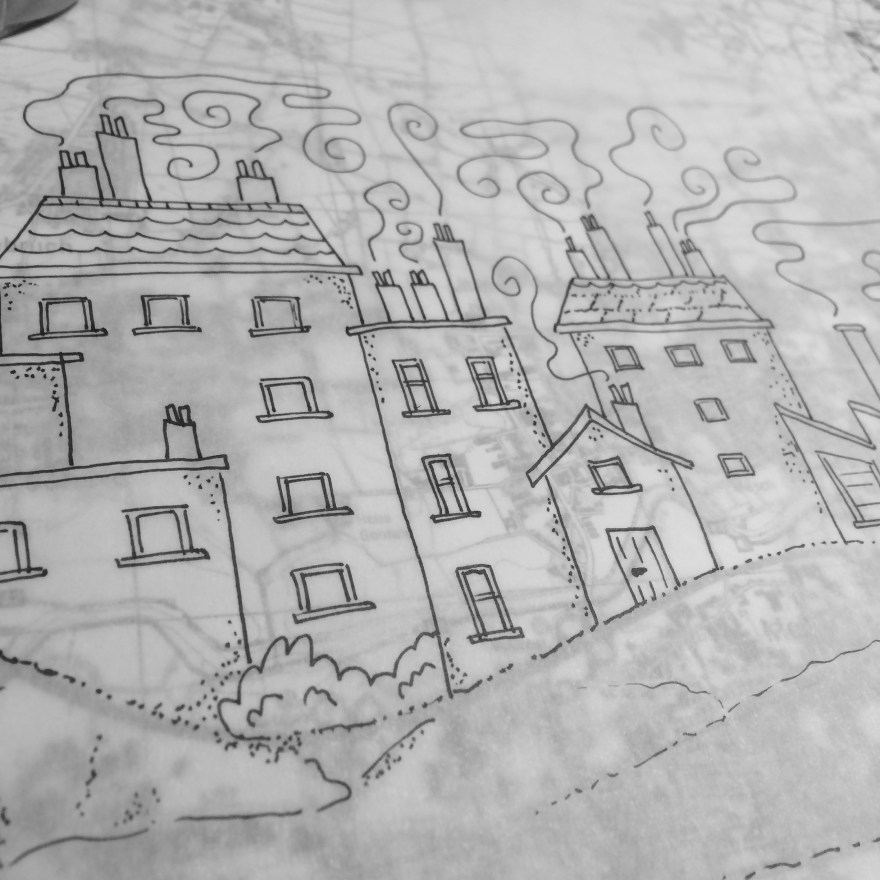
The artwork is constructed of layers of rice paper and maps of the Bad Oeyenhausen area containing the old Schokoladenfabrik building, which are visible beneath.”
About the process
For this piece I was inspired by the format (120cm portrait), the location and the concept of Palimpsest – which aligned with my ongoing interest in architecture and the relationship between people and the buildings they inhabit, particularly when those uses and facades change and grow together.
With the requirement for a long work, I wanted to work with a continuous sheet of paper of an appropriate size. I also wanted to include a map of the local area in which the exhibition and the tours would be held.
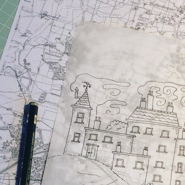
Therefore I combined a long sheet of rice paper with maps of Bad Oeyenhausen to allow both to be shown without impacting on the surface work itself.
It was also particularly relevant as I had recently been exploring cartography as art and drawing, as part of my studio work.
First, I had to test my hypothesis that by drawing on rice paper, enough of the map would be visible beneath
I created some practice drawings using Derwent Grafik pens as an initial experiment.
It actually created a nice balance with the relative opacity of the paper, so that there was an impression of the map behind, without obscuring or over-complicating the illustration on top.
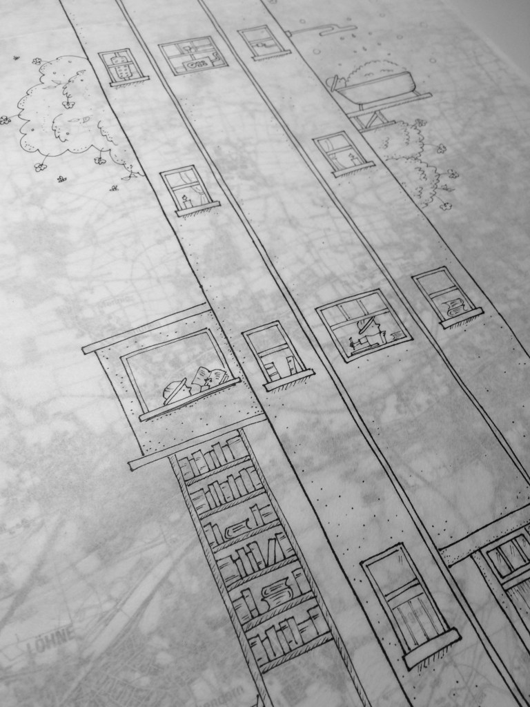
When working with the rice paper, I soon realised two things.
You cannot use pencil. Or at least, you cannot erase pencil, as it destroys the paper. Therefore you need to draw in ink first time, and you have to get it right.
The ink bleeds massively into the paper, especially if your drawing uses slow and methodical marks, rather than broad light gestures. So whereas on standard drawing paper I might use Derwent Grafik pens to provide a little more movement and fluidity (because my lines are slow and methodical and can look a little rigid), when working with rice paper I needed to use drawing pens with more control.
Here you can see how I experimented with different pen sizes for different features in the architecture, working out which nib size of which drawing pen brand I would need to replicate the effect I’d expect on standard drawing paper.
In the end I settled on a combination of Unipin and Sakura Micron Pigment markers of various sizes, and used this as a constant guide as I developed the final work.
In order to work at this size, and fully understand the dimensions with which I was working, I pinned the full length map to a roll of fabriano drawing paper and taped it to my studio wall.
And because, as previously established, I only had one shot to draw this directly in ink, I basically had to pre-draw the framework on an identically sized piece of paper and copy across.