Watercolour & drawing process

Today I’m sharing my approach to watercolour and ink drawing which I use for my instagram project, @NeverTooManyChickens.

All of these are original drawings, using ink pens and gouache (watercolour) on watercolour paper. For instagram, I usually do further editing of the main image in Photoshop to make the colours look more like they do in real life, rather than what the iPhone camera captures.

Materials

A quick summary of materials, before I walk through my process and my “whys”:

The models

I’m lucky that instagram is full of chickens and chicken parents who nominate their critters to be drawn!

Look at this beauty..

Pencil (for once)

My first step is to draw a rough pencil outline, and then ink over the top. This is the only project I have where I actually use pencil first rather than going straight to ink. This is because, frankly, I’m not terribly good at drawing real chickens from life – hence I started the project to get better at it!

Winsor & Newton graphite pencils

For this I’m using a standard 2B graphite pencil from Winsor & Newton. If you’re working in pencil you probably have, or should get, some kind of box set as it’s more cost-effective. This studio collection from Winsor & Newton is standard and reliable, but there are a lot of options out there.

Inking

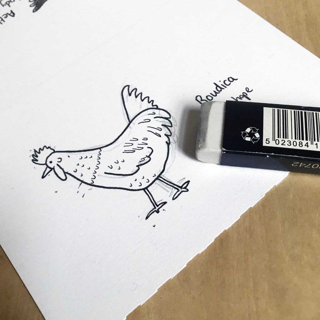
Once I’m happy with the rough shape and features, I then create a line drawing. Here I’m using Derwent Line Makers and using a standard plastic eraser. My pencil is quite light, and as I’m using pigment pens and erasing carefully, it doesn’t damage the ink work.
Painting

From there I just attempt to match the colours as well as I can. I have some key go-to colours from the Holbein Artists Gouache set that I have set up in my Daisy Palette.
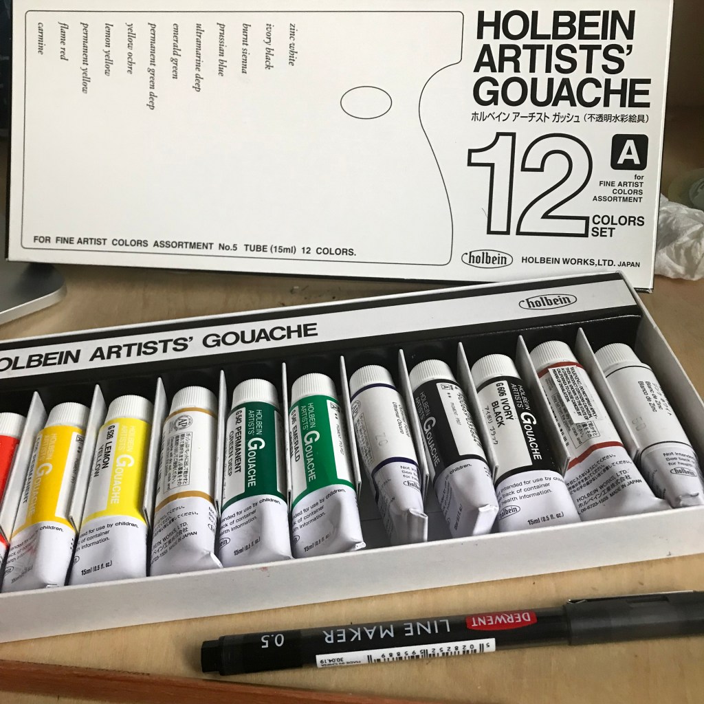
Because it’s watercolour, I can let it dry out on the palette, keep it covered, and reuse it each time I need to work.

These are small drawings, so they use very little paint.

Using this little paint, with this much accuracy means it’s almost more like inking the image than traditional painting.
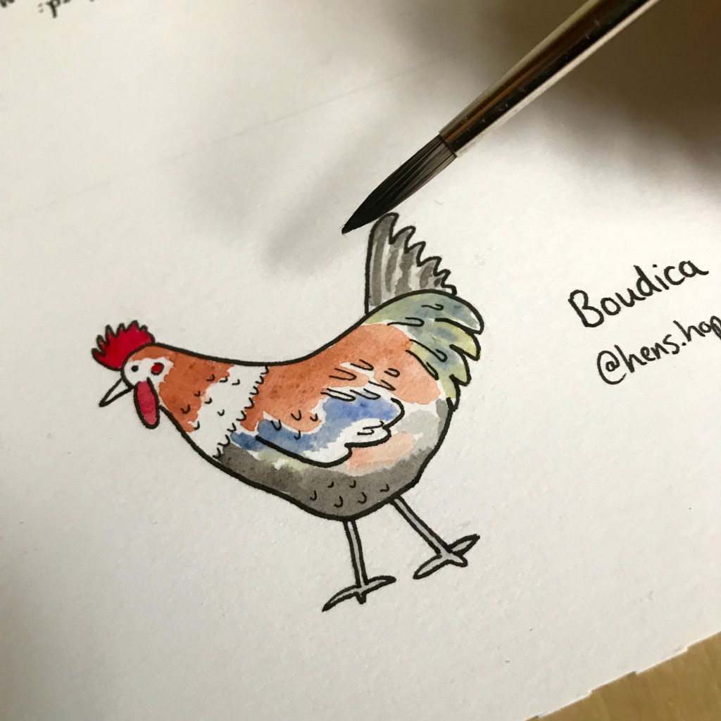
For Boudica, you can see that I had to go outside of my core colour base and add blue and green! Not your usual chicken colours!

For my brush, I’m using this Jacksons synthetic – Onyx size 6. Does the job, and is kind to animals.

Final work

Here’s the final artwork just snapped with my iPhone.
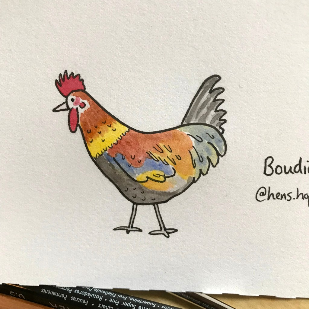
And here you go – the final drawing, post-editing, added to Instagram.
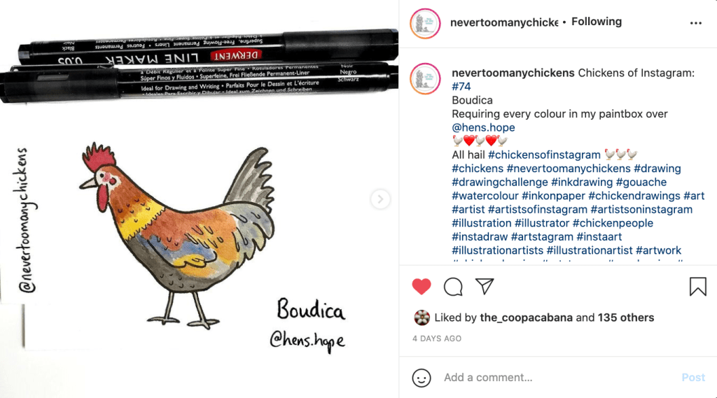
To see more of these, head over to Instagram and follow @NeverTooManyChickens.

Or sign up to my newsletter to get regular updates on all my projects.
Converse – Drawing on sneakers

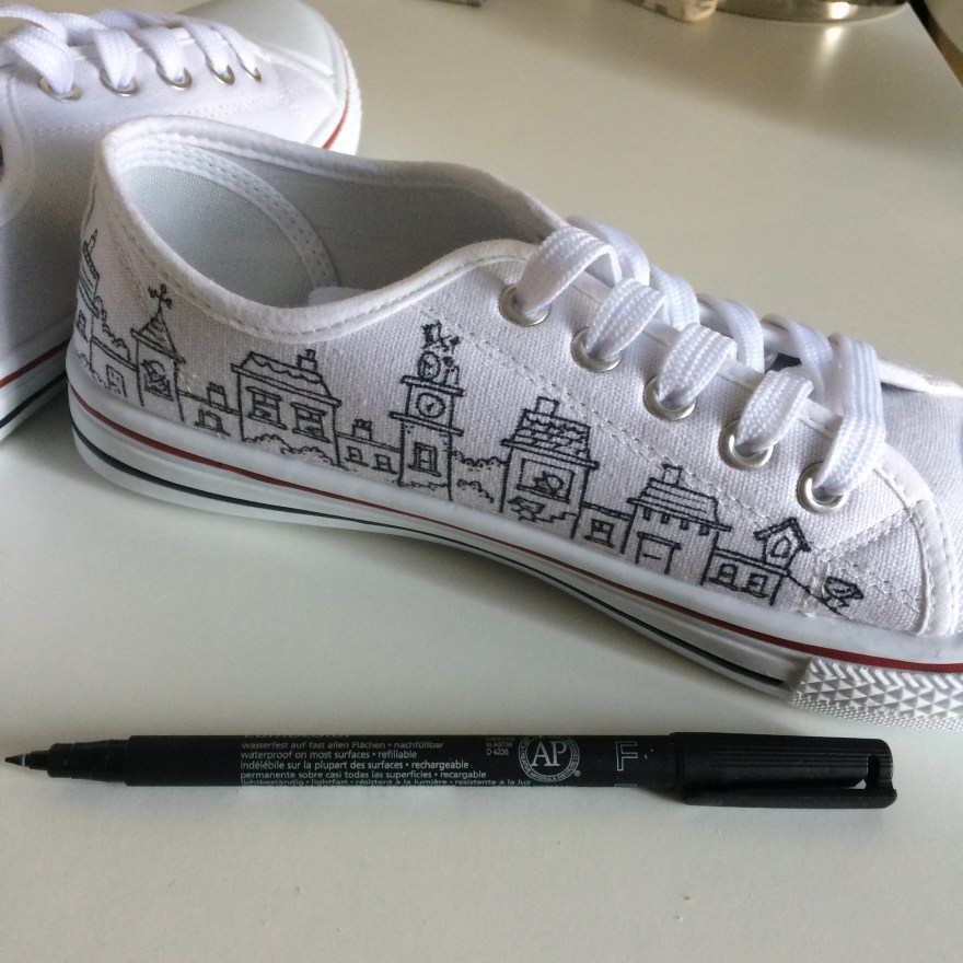
I have recently been experimenting with drawing on trainers, specifically; white Converse (or cheaper alternatives!). Although most of my work is ink on paper, I also enjoy branching out and seeing what materials allow me to draw on other surfaces such as walls, plasticwindows or even eggshells.

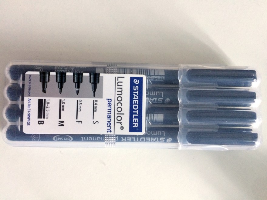
Initially, I tried both Sharpies and fine line permanent markers on old converse (grey) and cheap white canvas sneakers.

As you can see, although not dreadful, there is some bleeding into the material. The permanent markers gave me far more control than sharpies, so those were definitely the right pen – but how would I get the line to be crisper and cleaner and more like my work on paper? Especially as I wanted to move on from cheap canvas shoes to real Converse – and you don’t want to mess those up at £40+ per pair.

So, as with all things art supplies, I asked my friends at Jacksons Art what they’d suggest to help prime this kind of canvas so that I could create a cleaner line effect.

The recommendation from Jacksons was to experiment. Helpfully, they suggested 4 different types of primer that might work. And so the experiment began.

***

The following is an arts materials review. No doubt, I am not using the materials for their intended purpose and therefore apologise to the manufacturers if I am in any way criticising their products  – I’m just trying to find a hack that works for this purpose.

***

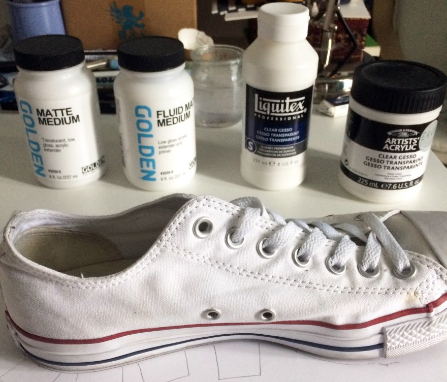
Types of primer:

  1. Golden Matte Medium
  2. Golden Fluid Matte Medium
  3. Liquitex clear gesso
  4. Winsor & Newton clear gesso

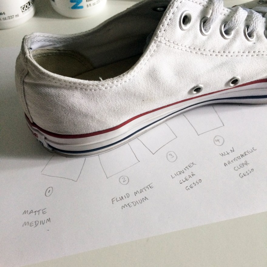
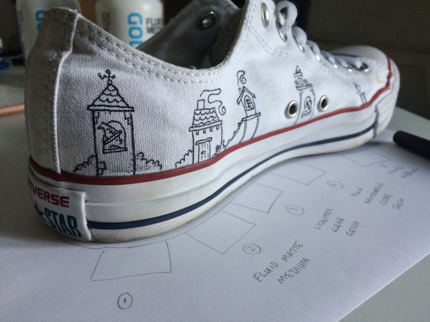
Next, I took a Converse sneaker (this was actually my own pair of size 8s that I was testing..!) and marked out 4 squares for the test.

I then applied each medium/gesso to the patch of canvas directly above, let it dry, assessed the effect, then drew on top to see how the permanent marker interacted with the gesso.

Findings – impact of gesso on canvas

What I was looking for was a light gesso, that wouldn’t make the canvas too stiff, wouldn’t remove the texture of the material, and wouldn’t darken or dirty that brilliant white.

  1. Golden Matte Medium

This one had the biggest impact on the material in that it darkened it considerably, even when dry. This picture is of the heel of the shoe which I thought might have contributed, but I did another test near the toe and it did the same thing.

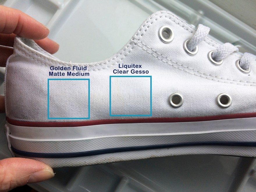
2. Golden Fluid Matte Medium &  3. Liquitex clear gesso

These two were probably best in terms of impact/effect on the canvas – they neither left dark stains, nor were so thick that they obscured the texture of the canvas.

4. Winsor & Newton Clear Gesso

This one came out the thickest, obscuring the most of the canvas texture. Unlike the Golden Matte Medium, it didnt darken the material and kept it nice and white, but it almost looked like a thickly primed painting canvas.

Findings – drawing on gesso

For the next stage, once the gesso was dry I use the permanent marker to create some sample drawings.

Note: if you see someone with partially drawn on white converse, that will be me..

  1. Golden Matte Medium

This didn’t work for me. It felt like I was drawing on hard lumpy plastic or hardened glue. You can probably see from the way the roof of the turret is bumpy where I lost control of my pen on the uneven surface. Control is absolutely paramount to me so this, combined with the darkening effect puts this gesso in last place for me in this test.

2. Golden Fluid Matte Medium

This one was much easier to draw on than the Golden Matte (non-Fluid), but still felt a little bit scratchy compared to the next.

3. Liquitex Clear Gesso

The thing I liked about this one, was the ease of drawing (i.e. smoothness), compared to the level of detail I could achieve.

4. Winsor & Newton Clear Gesso

Remember, this is the one that went on thickest and removed the texture of the canvas. It was relatively easy to draw on (because it had smoothed out the texture underneath) and the black seemed to look blacker as a result. However, for some reason it seemed that I couldn’t get the same level of detail as the Golden Fluid Matte Medium and the Liquitex Clear. Take a look at the hat in the drawing, and the way the lines are almost blurring together.

Conclusion

I’m keeping the Golden Fluid Matte Medium and the Liquitex Clear, and would definitely buy both in future for this purpose, depending on what I could get my hands on. However, I’m starting with the Liquitex on all my current projects and commissions.

Now check out the difference between primed and unprimed – the expensive blimmin failure that was this pair of baby/kids Converse!!

Here are links to the products used in this test and in these sneakers (coming soon to my Etsy store).

Note: Jacksons don’t currently stock the permanent markers, so I had to spend a ton on Amazon. Tweet them and they tend to supply once you demand. 🙂

Update Nov 2021 – Jacksons do now stock Staedtler Lumocolor markers!

Golden Matte Medium

Golden Fluid Matte Medium

Liquitex clear gesso

Winsor & Newton clear gesso