Today I’m sharing my approach to watercolour and ink drawing which I use for my instagram project, @NeverTooManyChickens.
All of these are original drawings, using ink pens and gouache (watercolour) on watercolour paper. For instagram, I usually do further editing of the main image in Photoshop to make the colours look more like they do in real life, rather than what the iPhone camera captures.
Materials
A quick summary of materials, before I walk through my process and my “whys”:
I’m lucky that instagram is full of chickens and chicken parents who nominate their critters to be drawn!
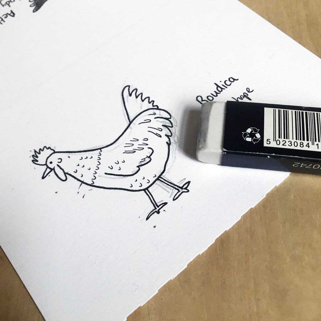
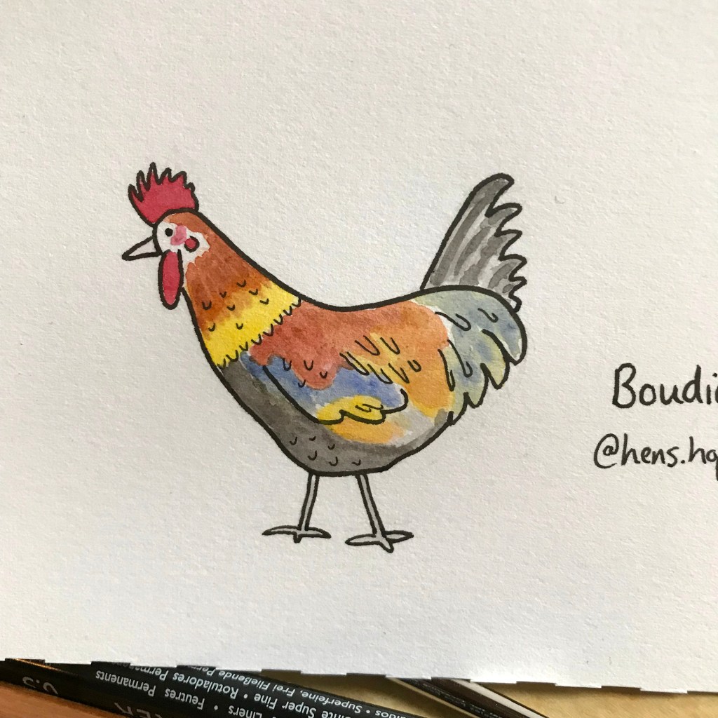
Look at this beauty..
Pencil (for once)
My first step is to draw a rough pencil outline, and then ink over the top. This is the only project I have where I actually use pencil first rather than going straight to ink. This is because, frankly, I’m not terribly good at drawing real chickens from life – hence I started the project to get better at it!
Winsor & Newton graphite pencils
For this I’m using a standard 2B graphite pencil from Winsor & Newton. If you’re working in pencil you probably have, or should get, some kind of box set as it’s more cost-effective. This studio collection from Winsor & Newton is standard and reliable, but there are a lot of options out there.
Inking
Once I’m happy with the rough shape and features, I then create a line drawing. Here I’m using Derwent Line Makers and using a standard plastic eraser. My pencil is quite light, and as I’m using pigment pens and erasing carefully, it doesn’t damage the ink work.
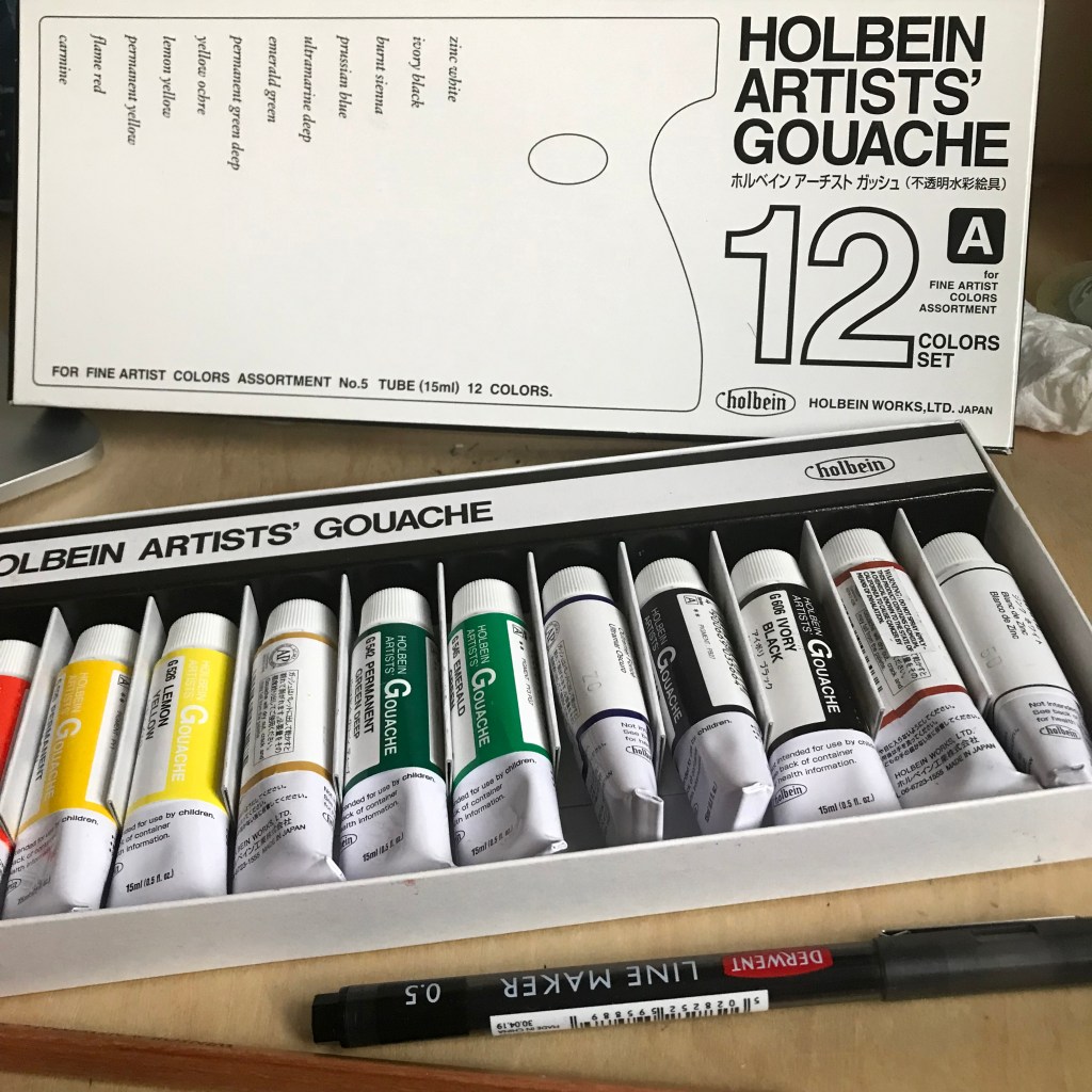
Painting
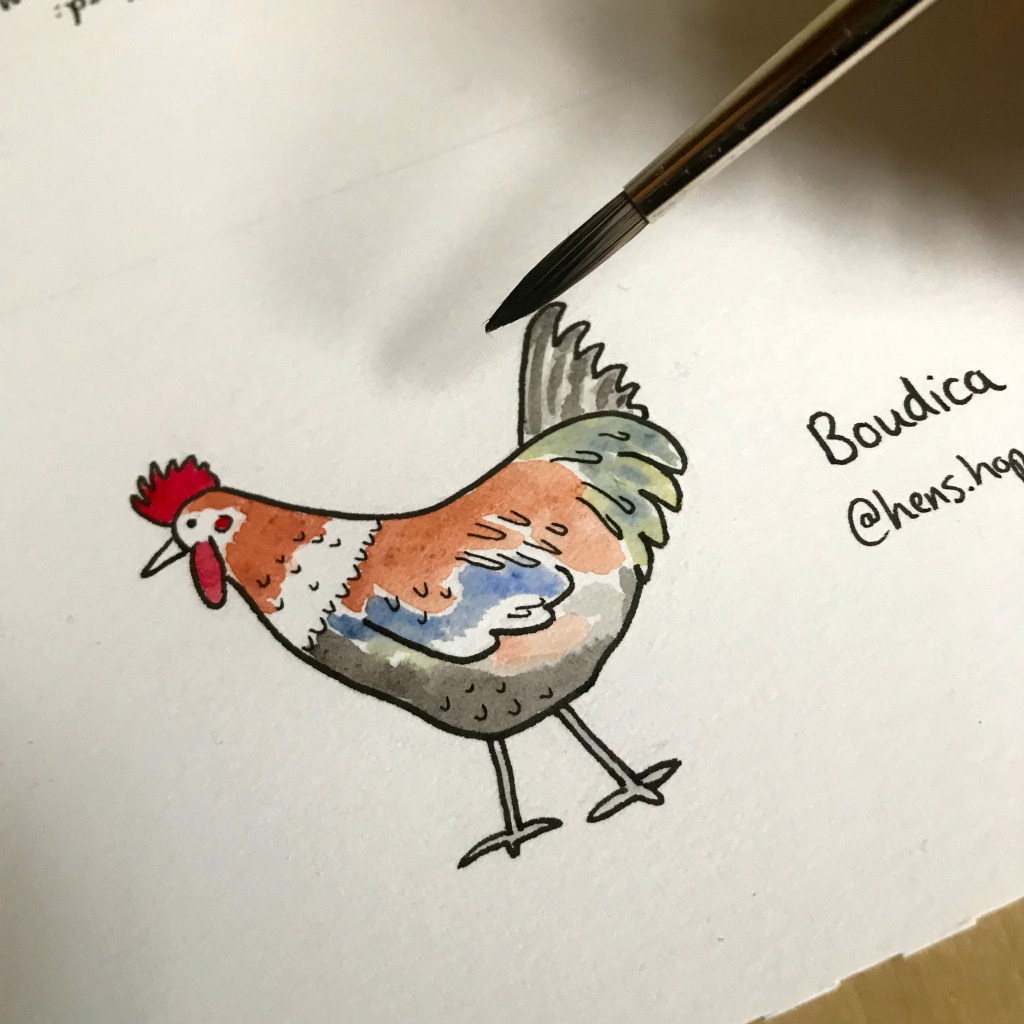
From there I just attempt to match the colours as well as I can. I have some key go-to colours from the Holbein Artists Gouache set that I have set up in my Daisy Palette.
Because it’s watercolour, I can let it dry out on the palette, keep it covered, and reuse it each time I need to work.
These are small drawings, so they use very little paint.
Using this little paint, with this much accuracy means it’s almost more like inking the image than traditional painting.
For Boudica, you can see that I had to go outside of my core colour base and add blue and green! Not your usual chicken colours!
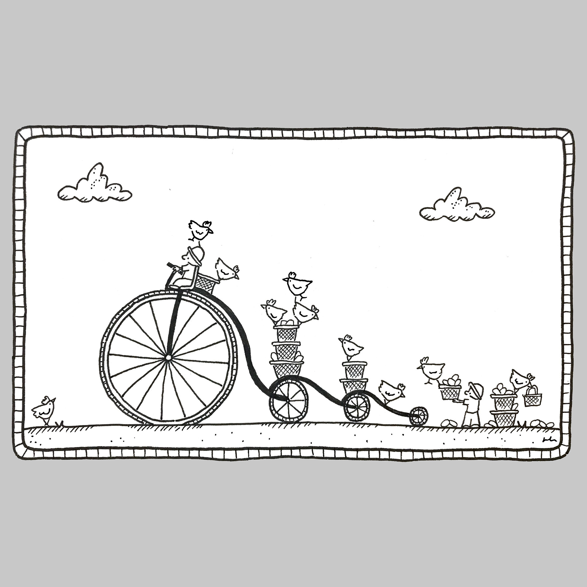
A recent commission titled: “Delivery Bike” (SOLD) Ink on paper.
I often get questions over on Instagram about what I use and how when making my ink drawings. So that’s what I’m going to cover today!
Method
It’s probably important to know the “what I am trying to do” before any of the materials decisions make sense!
Pencil or no pencil?
The most frequent question I get asked is “where are the pencil lines?” Well that’s simple – I don’t use pencil. Not sure why, but I’ve always just gone straight to ink. I think it might originally have been laziness, or a dislike of the way most erasers damage the richness of the ink, or it might have been to stop myself over-thinking everything I draw!
Probably all of the above.
Straight to ink. No pencil, no safety net.
Materials
For black and white line drawing, I basically only use two things – pen and paper. I like to keep it simple, which I think is reflected in the work! Also, the fewer materials I have to carry round, the less set up – and this means I’m more likely to sit down and draw something wherever I am, rather than need some elaborate set up.
This is particularly useful at the moment, when I’m living between cities and without a single large studio to work in.
Pens
The most important thing for me is pigment ink; the work has to be light-fast. Also, I prefer pens that are waterproof as it reduces the chance of smudging, especially on a hot day!
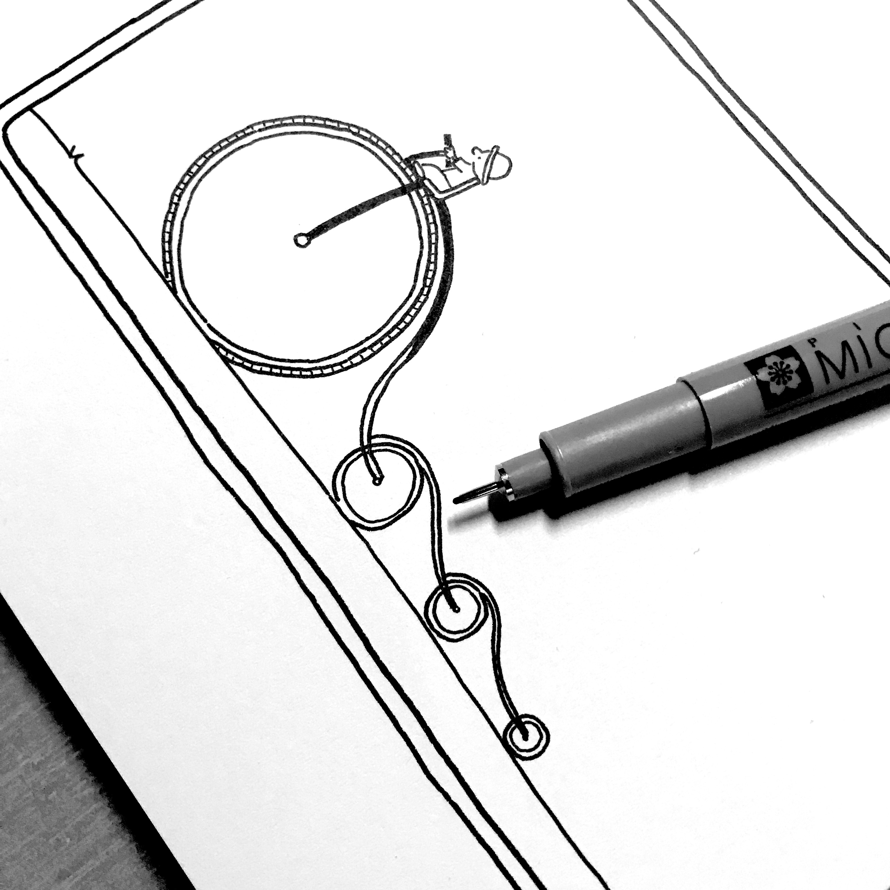
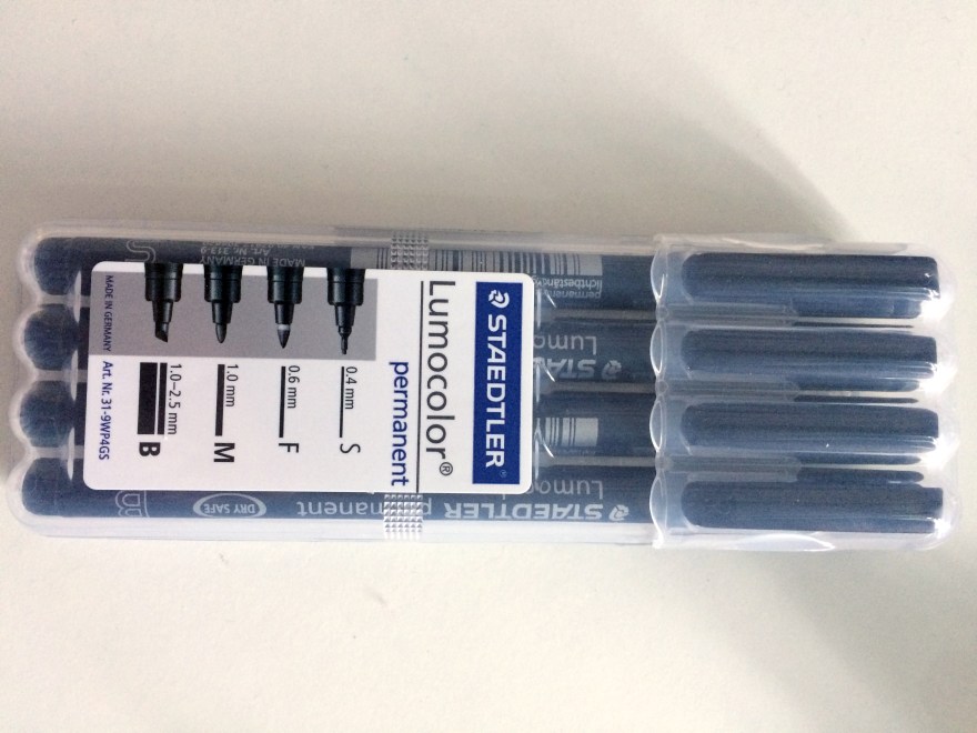
#1 Sakura Pigma Micron Fineliners
My go-to pens for many years now have been Sakura Pigma Micron Fineliners. I have a standard 6 pack in every drawing bag and case I have, but you can see the full range here.
I used them through Inktober 2020 and I still use Derwent Graphik Linemakers for my project @NeverTooManyChickens. I can’t remember why I didn’t use the Microns – it might have been that I didn’t have any to hand, or someone had given me these to try, but now it’s a habit I can’t break.
Part of me wonders if they feel slightly more robust when drawing on watercolour paper – that’s the only thing I can think of.
#3 Unipin
Unipins were the first drawing pen I ever used, and so they have a special place in my heart. I also still believe that their 0.05 is the finest out there without investing in the inky mess of Rotring Rapidograph.
#4 Molotow Blackliner
A late addition to my suite of pens is the Molotow Blackliner – but oh my these are delicious. I think I was gifted some to try and fell in love. They are really dark black and flow really well. I used them for my entire book The Wizards of Cattywumpus because they were just a joy to use. A little harder to control the ink flow, so I still stick with my Microns for day to day use, but I adore these.
Paper
Ok, so paper is tricky because.. “it depends”.
In general, these days I use sketchbooks not sheets or pads. But there are some exceptions:
Commissions – need to be on a single sheet so that I can work for a long time on a flat surface, and then send the single item out to someone
Books – I tend to do the artwork on sheets of marker paper because I know they will be scanned and turned into digital work – never sold as originals and therefore don’t have to be high quality rag paper
@NeverTooManyChickens – all on hot press watercolour paper, because well.. I’m then painting them with gouache
But for day-to-day use I tend to use sketchbooks because these days, the paper quality is excellent and I if I can manage to carry the same sketchbook around for a period of time, I tend not to lose them all!
Features of a sketchbook
I’ve been using them for a few years now, so I’ve ended up with a clear set of preferences:
1. Paper has to be thick
Generally, I need paper to be of a reasonably heavy weight. This is because I don’t want my beautiful dark pigment ink to soak straight through, and because I may get asked to sell a drawing and so I need it to be of a high quality outside of the sketchbook.
2. Paper has to be smoooth
I don’t know where this comes from, but I’m generally not a fan of bumpy paper. It makes the lines wiggly and generally life a lot harder than I want it to be!
3. Covers have to be hard
I used to use all sorts of sketchbooks, but with extensive travelling, I now prefer sketchbooks with a hard cover and a band around them, so that I can chuck them in a bag or case without too much worry that they’ll get squished
4. Paper usually has to be white
I prefer very white paper. Partly because I just prefer pure black on pure white, and partly because it’s so much easier to take photos for Instagram!
My go-to sketchbooks
So, the sketchbooks that meet the above criteria, that I use all the time are:
Stillman & Birn Zeta – I mean the whole series is to die for, but they hard hard cover and spirals which makes life super-easy. And the paper is the smoothest and whitest I’ve found. Heaven.
Moleskine hard covers – I used to use these all the time, but the paper is a little lightweight and usually a little cream/yellow unless you buy the watercolour/drawing paper versions. These will still do for me in a pinch, especially working with Microns because the bleed through isn’t too bad. It’s good that I can grab these at an airport for example, if I have failed to plan ahead properly!
Royal Talens – This is what I’m using the most at the moment. These were given to me and I was hesitant at first – because I didn’t choose them(!) and because the paper is not quite white – it’s a little off-white or almost cream. Also not as smooth as the Zeta. But for reasons I cannot quite put my finger on, I’m really enjoying them.
I think perhaps because the paper has a really nice weight to it, and the cover feels high quality and extends nicely beyond the end of the paper. Also, despite being a white cover, I have thrown them in and out of bags with no damage or marks either to the cover or the pages inside.
What else? (a cheat)
One more question I get is “how do you draw such straight lines?”
There are two answers to that:
a) Practice
b) Cheat
In most of my sketchbooks, I keep pre-cut pieces of paper, or even post it notes!
Top tip: when using guides that you inevitably store in the back of your sketchbook, a thicker sketchbook paper like Talens, rather than that of a Moleskine prevents any impact through the paper you’re drawing on. Most of the time I don’t use guides, but when I’m doing something like Inktober and I want all of the cartoon panels to be consistent – that’s what I use.
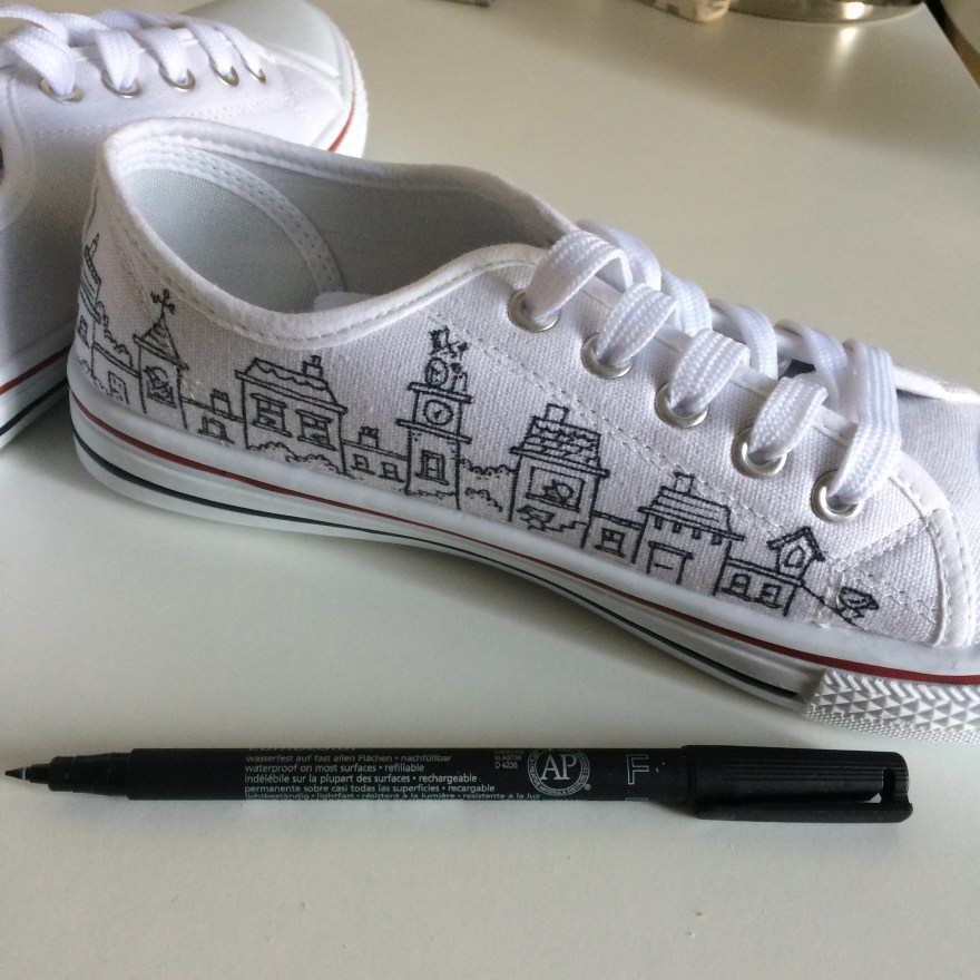
I have recently been experimenting with drawing on trainers, specifically; white Converse (or cheaper alternatives!). Although most of my work is ink on paper, I also enjoy branching out and seeing what materials allow me to draw on other surfaces such as walls, plastic, windows or even eggshells.
Initially, I tried both Sharpies and fine line permanent markers on old converse (grey) and cheap white canvas sneakers.
As you can see, although not dreadful, there is some bleeding into the material. The permanent markers gave me far more control than sharpies, so those were definitely the right pen – but how would I get the line to be crisper and cleaner and more like my work on paper? Especially as I wanted to move on from cheap canvas shoes to real Converse – and you don’t want to mess those up at £40+ per pair.
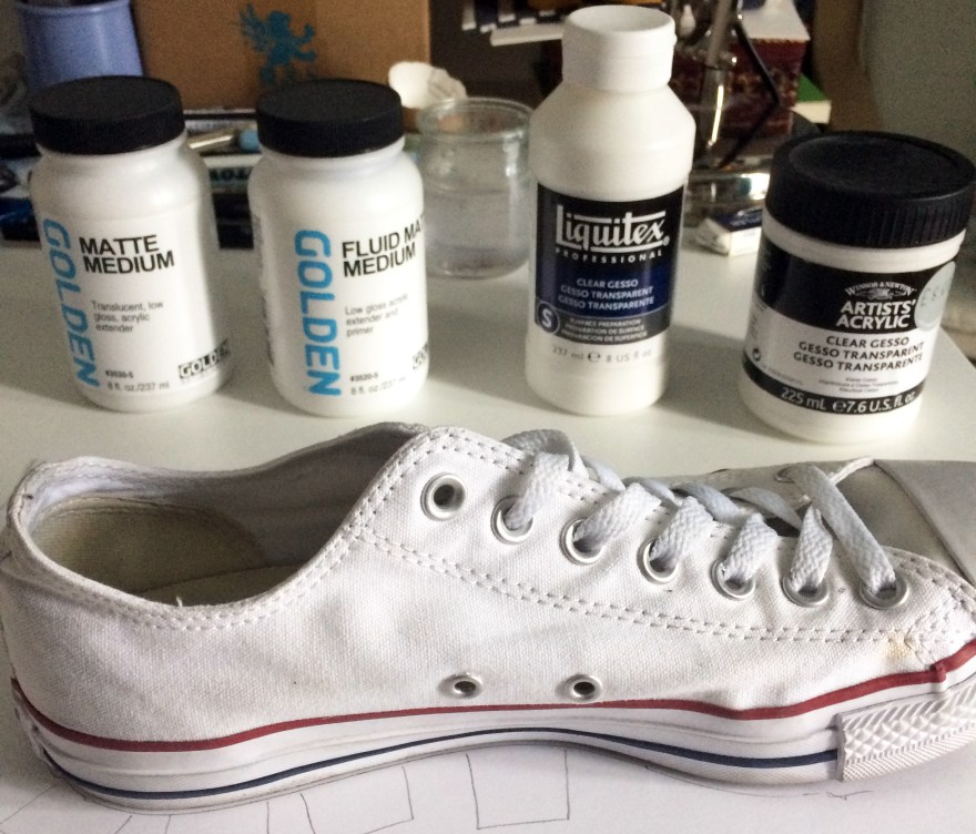
So, as with all things art supplies, I asked my friends at Jacksons Art what they’d suggest to help prime this kind of canvas so that I could create a cleaner line effect.
The recommendation from Jacksons was to experiment. Helpfully, they suggested 4 different types of primer that might work. And so the experiment began.
***
The following is an arts materials review. No doubt, I am not using the materials for their intended purpose and therefore apologise to the manufacturers if I am in any way criticising their products – I’m just trying to find a hack that works for this purpose.
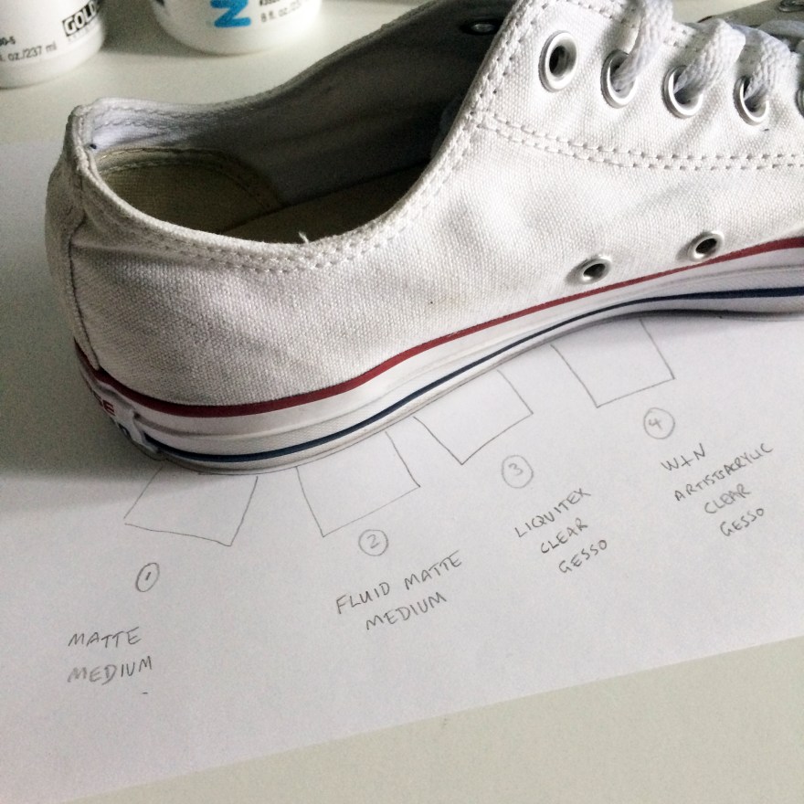
Next, I took a Converse sneaker (this was actually my own pair of size 8s that I was testing..!) and marked out 4 squares for the test.
I then applied each medium/gesso to the patch of canvas directly above, let it dry, assessed the effect, then drew on top to see how the permanent marker interacted with the gesso.
Findings – impact of gesso on canvas
What I was looking for was a light gesso, that wouldn’t make the canvas too stiff, wouldn’t remove the texture of the material, and wouldn’t darken or dirty that brilliant white.
Golden Matte Medium
This one had the biggest impact on the material in that it darkened it considerably, even when dry. This picture is of the heel of the shoe which I thought might have contributed, but I did another test near the toe and it did the same thing.
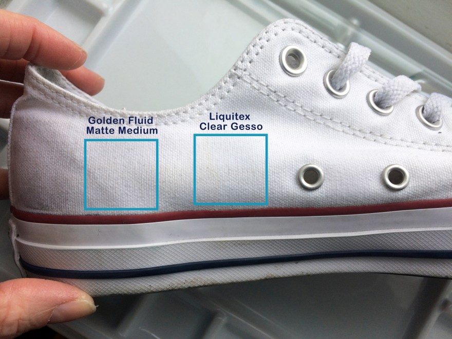
2. Golden Fluid Matte Medium & 3. Liquitex clear gesso
These two were probably best in terms of impact/effect on the canvas – they neither left dark stains, nor were so thick that they obscured the texture of the canvas.
4. Winsor & Newton Clear Gesso
This one came out the thickest, obscuring the most of the canvas texture. Unlike the Golden Matte Medium, it didnt darken the material and kept it nice and white, but it almost looked like a thickly primed painting canvas.
Findings – drawing on gesso
For the next stage, once the gesso was dry I use the permanent marker to create some sample drawings.
Note: if you see someone with partially drawn on white converse, that will be me..
Golden Matte Medium
This didn’t work for me. It felt like I was drawing on hard lumpy plastic or hardened glue. You can probably see from the way the roof of the turret is bumpy where I lost control of my pen on the uneven surface. Control is absolutely paramount to me so this, combined with the darkening effect puts this gesso in last place for me in this test.
2. Golden Fluid Matte Medium
This one was much easier to draw on than the Golden Matte (non-Fluid), but still felt a little bit scratchy compared to the next.
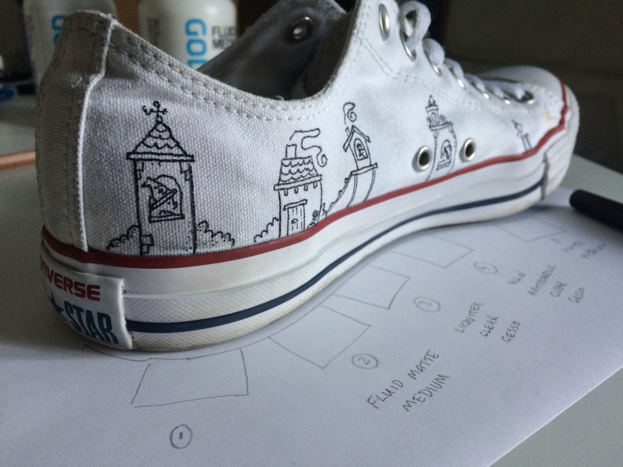
3. Liquitex Clear Gesso
The thing I liked about this one, was the ease of drawing (i.e. smoothness), compared to the level of detail I could achieve.
4. Winsor & Newton Clear Gesso
Remember, this is the one that went on thickest and removed the texture of the canvas. It was relatively easy to draw on (because it had smoothed out the texture underneath) and the black seemed to look blacker as a result. However, for some reason it seemed that I couldn’t get the same level of detail as the Golden Fluid Matte Medium and the Liquitex Clear. Take a look at the hat in the drawing, and the way the lines are almost blurring together.
Conclusion
I’m keeping the Golden Fluid Matte Medium and the Liquitex Clear, and would definitely buy both in future for this purpose, depending on what I could get my hands on. However, I’m starting with the Liquitex on all my current projects and commissions.
Now check out the difference between primed and unprimed – the expensive blimmin failure that was this pair of baby/kids Converse!!
“Change” Limited edition hand-finished print, 23ct leaf on paper
I’ve been asked a few times about my method and process for gilding, suggestions on materials etc so here we go.
First off, I have to say that all materials knowledge is nabbed wholesale from Julie Caves at Jacksons Art Supplies who gave me all the recommendations that got me started. So any art supply links in this website will go to Jacksons. I’m sure other art supply shops also exist.
Enough caveats. Let’s talk materials.
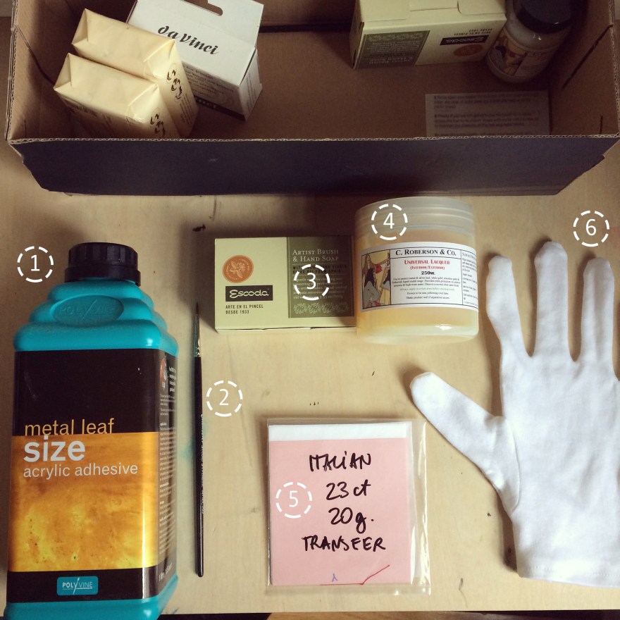
Art supplies and materials for working with gold leaf on paper
1. Acrylic adhesive Special adhesive for metal leaf, Polyvine acrylic gold size available here. This is what you’re going to use to make the surface the gold adheres to.
2. Brushes
I use one for use with the adhesive above, and one for working with the gold leaf. Only the glue brush shown here, so keep an eye out for a black brush in other pictures. I use brushes that look significantly different so that I don’t mix them up.
3. Soap
Any kind of surfactant can be used, but I use Escoda or DaVinci specialist artist brush soap which is gentle enough not to mess with the glue. Escoda is with olive oil, dontcha know.
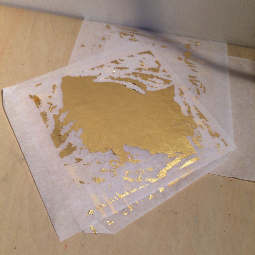
5. Gold leaf
I use 23ct gold leaf, 20g. It comes in transfer sheets which are really easy to work with and one pack lasts for ages.
6. Gloves (cloth)
You can buy these from tons of places – they’re light cotton gloves. Breathable enough that your hands don’t sweat, thick enough that the oil on your skin won’t tarnish the gold.
Right that’s enough on the shopping list, now what do we do with them.
Method for Gilding on paper
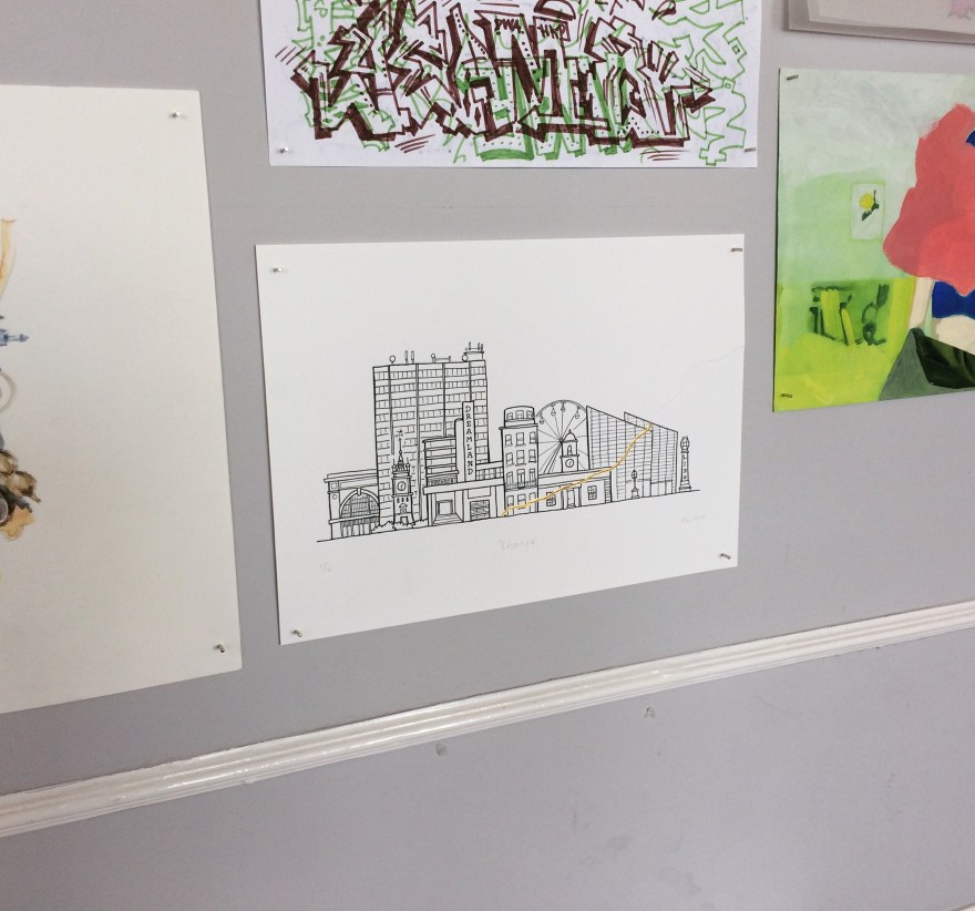
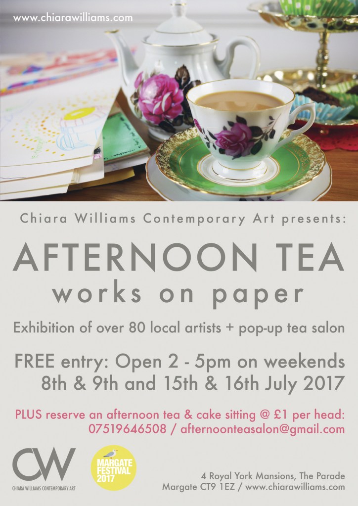
Here’s how I used the above supplies to create my recent work “Change” which is on display right now at Chiara Williams Contemporary Art exhibition “Afternoon Tea” in Margate.
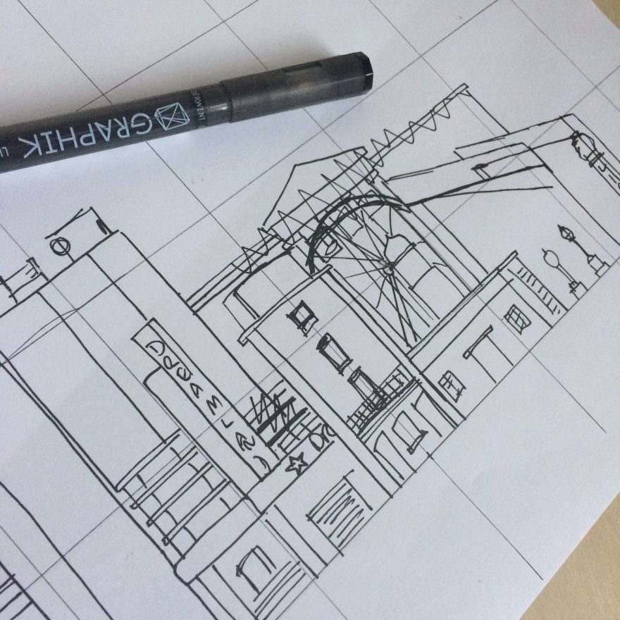
Step one – planning
First I created a grid to plan out the original drawing. This helps ensure that the buildings form the kind of overall shape I’m aiming for.
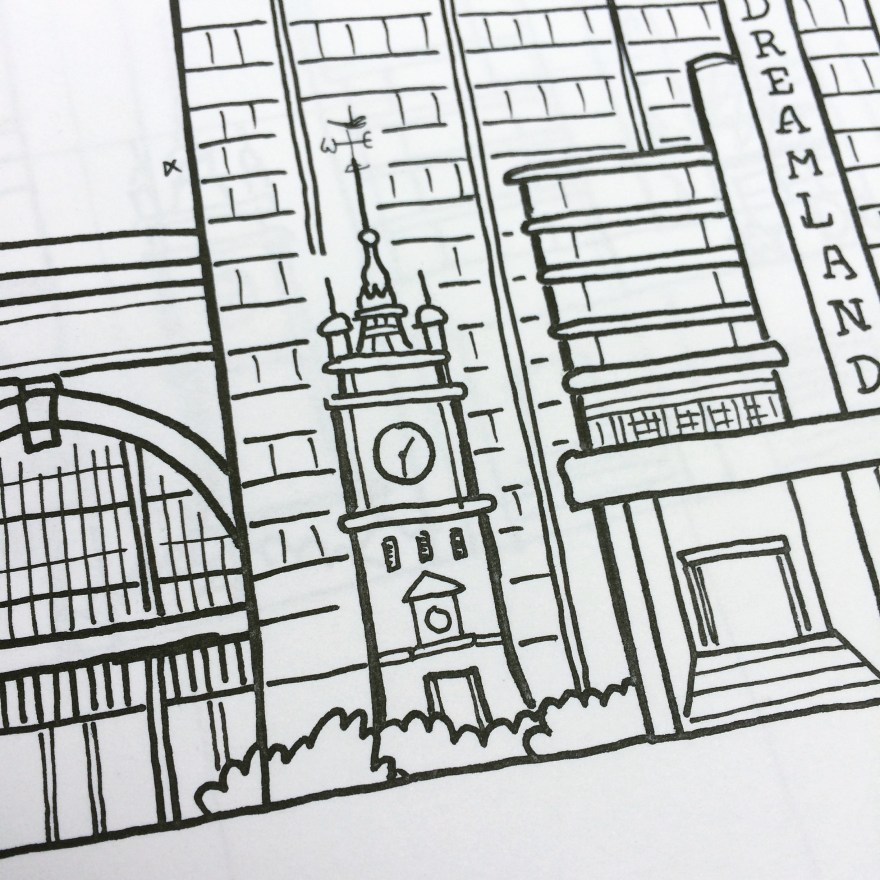
Step two – drawing
At this stage I’m drawing the detail of each building, but as I know I’m turning into a digital plate, I don’t have to worry too much about lines going over or minor errors. That’s what Photoshop is for.
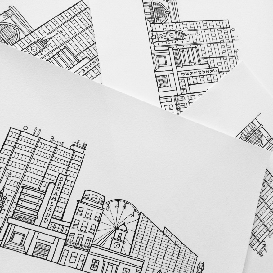
Step three – digital print edition (giclee)
The drawing is finished as a digital plate and the edition is printed using archival ink on cotton rag paper.
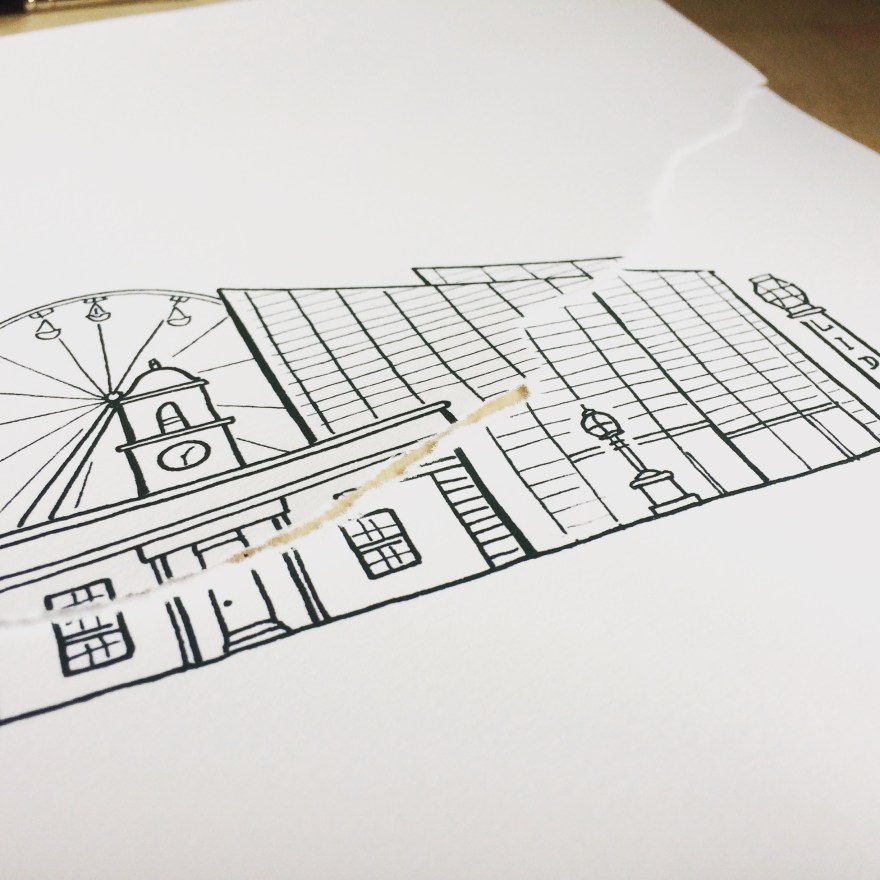
Step four – creating the tear
In order to recreate the idea of Kintsugi or Kintsukuoroi, the work on paper becomes more sculptural, as the physical form of the paper combines with the content of the drawing.
Each print in the edition of 10 is hand-torn. Although the tear starts and ends in approximately the same location, the path of the tear naturally differs, meaning that each print in the edition is unique, while the original image itself remains consistent.
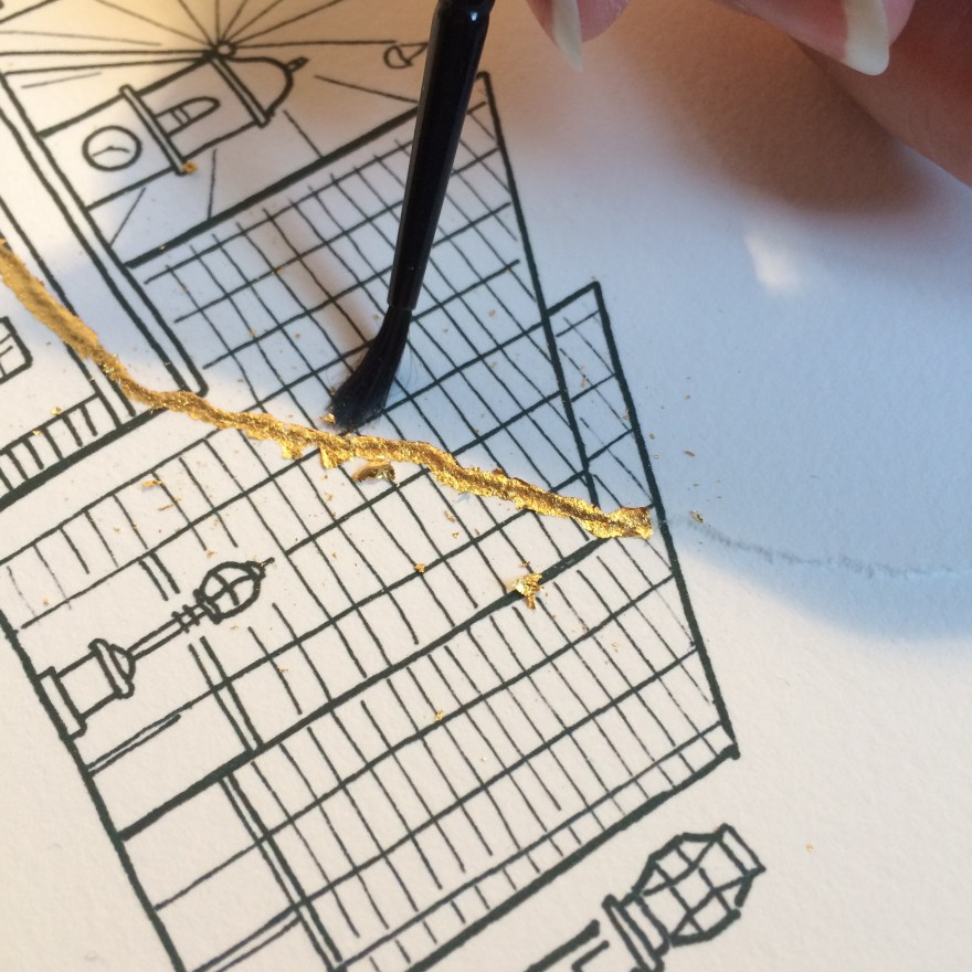
Step five – adhesive
The print is then carefully reassembled, with the two pieces matched back together as closely as possible. The glue or adhesive is then applied using a small brush. It’s absolutely essential that you take real care at this stage as the gold will stick exactly where you place the glue on the paper.
Here are some hints.
Use a separate brush only for this stage.
Pour some of the glue into a palette (I find ceramic is best for this) so that you can close the full bottle up as soon as possible after use
Apply a small amount of soap to the brush before introducing the brush to the adhesive, otherwise you’ll end up with your brush hairs glued permanently together really quickly
Follow the instructions on the bottle closely. In the example of the Polyvine, there are stated times to allow the glue to air dry and become tacky BEFORE even applying the gold. And then there’s a drying period after, before you can touch it or apply lacquer.
Wash the brush with more soap as soon as you can after you’ve made the line you want.
TOP TIP: As I found when I made my first Kintsugi print, make sure that the original work is 100% dry before you use glue and gold, otherwise this happens..
d’oh!!!
Step six – gilding!
Once the glue line is tacky (because you’ve followed the instructions, right? Then you need to take a sheet on gold leaf and apply it gold side down on the glued area, pressing firmly from the back.
As it’s a transfer, the gold should lift away from the sheet and adhere to the paper, where the glue is place.
Then, you’re going to want to press the gold to the paper, and this is where you’re going to use those important gloves.
TOP TIP: I find that using just one glove on my right hand makes me focus on what I’m doing and prevents me getting gold or glue all over the place.
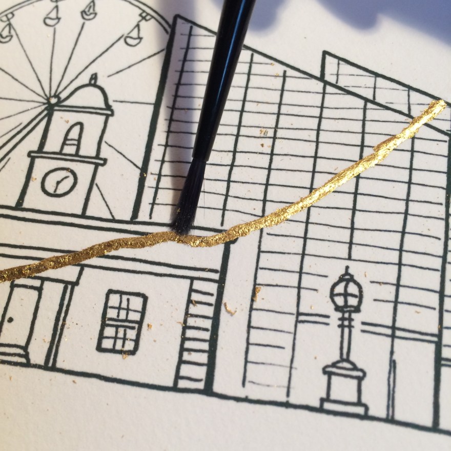
And the last stage of the gold bit, is to brush away the excess. This is where you’re going to use your second brush – not the one you used for glue!!
Assuming that you’ve allowed the adhesive to tackify properly (new word, you heard it here first) then you can use the brush to scrub gently at the edge of the line. This will remove all tiny crumbs of gold and give you a really crisp line.
Again, as you’re going to have flecks of gold flying around at this point, you will need to be completely sure that everything else on the page which is not the line you’re trying to create, is completely dry. No wet ink, no spots of glue. There’s nothing more depressing than adding a smear of glue where you don’t want one. Trust me..;)
Step 7 (Final step) – Varnish/Lacquer
Having left the work to dry completely (and following the instructions on the bottle of adhesive), you can then varnish the line of gold leaf that you’ve applied. If like me you’re applying fine lines, you’ll want to use a small brush to make sure you control the line. You want to be lacquering ONLY the gold and not the rest of the paper, because it will really show up if you’re hanging in an exhibition.
Here I used the same brush as I’ve used for the adhesive. I don’t use soap this time, but I do make sure I’ve cleaned it thoroughly before and straight after use.
Then, more drying because you need to let the lacquer dry.
Hey, I never said this wasn’t tedious.
Finished.
And there you go. Gold line complete.
This hand-finished edition, “Change” is on display in margate until 16th July.