Project Tortoise

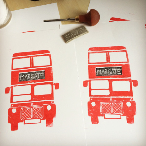
For the last two months I’ve been working on a commission for a community kitchen in Margate.

The brief was to create something along the lines of the Nando’s “check in chicken” (nope, I’ve never been to a Nando’s, so I had to google it), but to base them on my character “Señor Tortuga”.

******

Week 1 – Design

The first task was to design the overall solution. I decided to go with a wooden spoon and base, given the theme and remit of The Kitchen.

hinstow senor tortuga kitchenct9

Having ordered materials from that source of all random and unwitting art materials, Amazon, I had to go about the task of drawing an initial paper prototype.

hinstow senor tortuga kitchenct9

hinstow senor tortuga kitchenct9

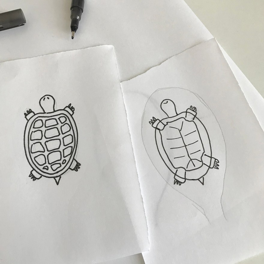
And check that it would fit inside the head of the spoon..

hinstow senor tortuga kitchenct9

Then before I was able to draw any tortoise outline or add any colour, I had to turn the wood into a canvas – by using gesso to prime the surface.

Week 2,3….. – Priming

hinstow senor tortuga kitchenct9

hinstow senor tortuga kitchenct9

hinstow senor tortuga kitchenct9

In total, priming took about 2 weeks as it required up to 4 layers, both sides, plus drying time across 12 “spoons”.

Week 4 – Outlines

hinstow senor tortuga kitchenct9

The initial outline for each tortoise, on each side, was done in ink from the beginning – no stencil, no pencil – straight on in ink, copying visually from my initial sketch by hand.

hinstow senor tortuga kitchenct9

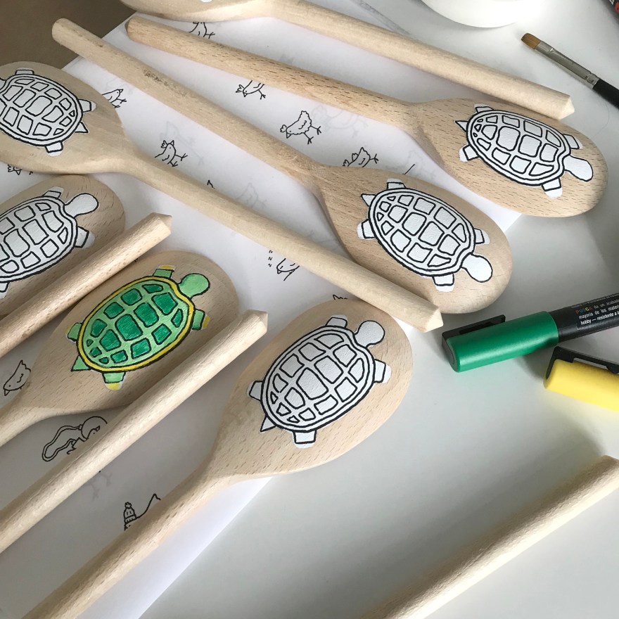
At the same time as drawing 24 sides of outlines, I took one tortoise through to colour, to ensure that the outline would hold enough colour contrasts and combinations.

Week 5,6 – Colours

hinstow senor tortuga kitchenct9

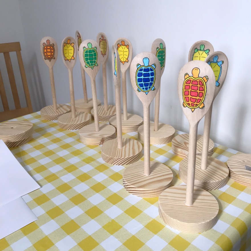
After establishing that the green colour combinations were successful, I then started the prototype for other colour combos, so I would end up with the following combos:

  1. Green/Green/Yellow (x3)

2. Red/Orange/Yellow (x3)

3. Blue/Blue/Yellow-green (x3)

4. Gold/Brown/Red (x3)

hinstow senor tortuga kitchenct9

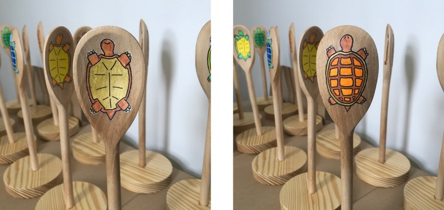
As you can see here, I also had to paint multiple layers of colour on each tortoise, (12×2 sides, 4 different designs). even with the layers of gesso as primer, colours quickly absorbed and needed to be covered over at least 3 times each.

After which, the original black line had been obscured, and so had to be inked over again. (12×2).

Week 7 – Finishing painting

hinstow senor tortuga kitchenct9

hinstow senor tortuga kitchenct9

hinstow senor tortuga kitchenct9

At the end of week 7, several final layers of paint and final black outlines went on.

Week 8 – Drilling, sanding, gluing and lots and lots of varnish

hinstow senor tortuga kitchenct9

It took a few goes to find a drill bit big enough for this. In the end,  had to use 4 different drills sizes and work my way up. And yes, a router would have been easier if I’d had one 🙂

hinstow senor tortuga kitchenct9

hinstow senor tortuga kitchenct9

And they all needed to be sanded back afterwards, as the giant drill had basically torn the holes out..

hinstow senor tortuga kitchenct9

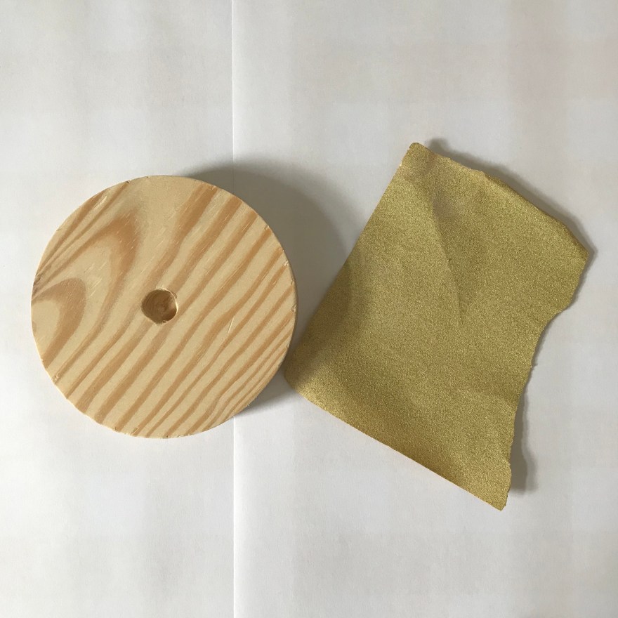
Before gluing, I had to use this little fella to ensure that any remaining gesso was removed from the edges of the artwork.

hinstow senor tortuga kitchenct9

And then gluing.. using titebond, non-toxic wood glue. Making sure that I left them for 24 hours to ensure no accidentally un-sticking occurred once I moved them for varnish.

hinstow senor tortuga kitchenct9

Finally, I climbed out on to the roof (sorry neighbours) and applied multiple coats of Golden artists varnish. Initially, gloss varnish to seal the artwork, then a matt varnish to achieve the overall effect I was looking for.

Here you see my impromptu spray hood, with the aim partially of helping the varnish land, but more importantly, keep bits of Margate roof dirt (or seagull contributions) off the drying varnish.

Week 9 – Done & delivered.

Finally these chaps were delivered over to The Kitchen. Mission accomplished.

hinstow senor tortuga kitchenct9

hinstow senor tortuga kitchenct9

hinstow senor tortuga kitchenct9

hinstow senor tortuga kitchenct9

Enamel pins – Tortoise

I’m very excited to have one of my characters translated into another enamel pin, which is now available on etsy.

This character is called “Señor Tortuga” and appears with moderate frequency in my Instagram cartoon doodles.

Here are some process pics.

If you want to grab one of these, or any of my other work, just head to Etsy.

Converse – Drawing on sneakers

I have recently been experimenting with drawing on trainers, specifically; white Converse (or cheaper alternatives!). Although most of my work is ink on paper, I also enjoy branching out and seeing what materials allow me to draw on other surfaces such as walls, plasticwindows or even eggshells.

Initially, I tried both Sharpies and fine line permanent markers on old converse (grey) and cheap white canvas sneakers.

As you can see, although not dreadful, there is some bleeding into the material. The permanent markers gave me far more control than sharpies, so those were definitely the right pen – but how would I get the line to be crisper and cleaner and more like my work on paper? Especially as I wanted to move on from cheap canvas shoes to real Converse – and you don’t want to mess those up at £40+ per pair.

So, as with all things art supplies, I asked my friends at Jacksons Art what they’d suggest to help prime this kind of canvas so that I could create a cleaner line effect.

The recommendation from Jacksons was to experiment. Helpfully, they suggested 4 different types of primer that might work. And so the experiment began.

***

The following is an arts materials review. No doubt, I am not using the materials for their intended purpose and therefore apologise to the manufacturers if I am in any way criticising their products  – I’m just trying to find a hack that works for this purpose.

***

Types of primer:

  1. Golden Matte Medium
  2. Golden Fluid Matte Medium
  3. Liquitex clear gesso
  4. Winsor & Newton clear gesso

Next, I took a Converse sneaker (this was actually my own pair of size 8s that I was testing..!) and marked out 4 squares for the test.

I then applied each medium/gesso to the patch of canvas directly above, let it dry, assessed the effect, then drew on top to see how the permanent marker interacted with the gesso.

Findings – impact of gesso on canvas

What I was looking for was a light gesso, that wouldn’t make the canvas too stiff, wouldn’t remove the texture of the material, and wouldn’t darken or dirty that brilliant white.

  1. Golden Matte Medium

This one had the biggest impact on the material in that it darkened it considerably, even when dry. This picture is of the heel of the shoe which I thought might have contributed, but I did another test near the toe and it did the same thing.

2. Golden Fluid Matte Medium &  3. Liquitex clear gesso

These two were probably best in terms of impact/effect on the canvas – they neither left dark stains, nor were so thick that they obscured the texture of the canvas.

4. Winsor & Newton Clear Gesso

This one came out the thickest, obscuring the most of the canvas texture. Unlike the Golden Matte Medium, it didnt darken the material and kept it nice and white, but it almost looked like a thickly primed painting canvas.

Findings – drawing on gesso

For the next stage, once the gesso was dry I use the permanent marker to create some sample drawings.

Note: if you see someone with partially drawn on white converse, that will be me..

  1. Golden Matte Medium

This didn’t work for me. It felt like I was drawing on hard lumpy plastic or hardened glue. You can probably see from the way the roof of the turret is bumpy where I lost control of my pen on the uneven surface. Control is absolutely paramount to me so this, combined with the darkening effect puts this gesso in last place for me in this test.

2. Golden Fluid Matte Medium

This one was much easier to draw on than the Golden Matte (non-Fluid), but still felt a little bit scratchy compared to the next.

3. Liquitex Clear Gesso

The thing I liked about this one, was the ease of drawing (i.e. smoothness), compared to the level of detail I could achieve.

4. Winsor & Newton Clear Gesso

Remember, this is the one that went on thickest and removed the texture of the canvas. It was relatively easy to draw on (because it had smoothed out the texture underneath) and the black seemed to look blacker as a result. However, for some reason it seemed that I couldn’t get the same level of detail as the Golden Fluid Matte Medium and the Liquitex Clear. Take a look at the hat in the drawing, and the way the lines are almost blurring together.

Conclusion

I’m keeping the Golden Fluid Matte Medium and the Liquitex Clear, and would definitely buy both in future for this purpose, depending on what I could get my hands on. However, I’m starting with the Liquitex on all my current projects and commissions.

Now check out the difference between primed and unprimed – the expensive blimmin failure that was this pair of baby/kids Converse!!

Here are links to the products used in this test and in these sneakers (coming soon to my Etsy store).

Note: Jacksons don’t currently stock the permanent markers, so I had to spend a ton on Amazon. Tweet them and they tend to supply once you demand. 🙂

Update Nov 2021 – Jacksons do now stock Staedtler Lumocolor markers!

Golden Matte Medium

Golden Fluid Matte Medium

Liquitex clear gesso

Winsor & Newton clear gesso

Gilding – “Change”


“Change” Limited edition hand-finished print, 23ct leaf on paper

I’ve been asked a few times about my method and process for gilding, suggestions on materials etc so here we go.

First off, I have to say that all materials knowledge is nabbed wholesale from Julie Caves at Jacksons Art Supplies who gave me all the recommendations that got me started. So any art supply links in this website will go to Jacksons. I’m sure other art supply shops also exist.

Enough caveats. Let’s talk materials.

Art supplies and materials for working with gold leaf on paper

1. Acrylic adhesive
Special adhesive for metal leaf, Polyvine acrylic gold size  available here. This is what you’re going to use to make the surface the gold adheres to.

2. Brushes
I use one for use with the adhesive above, and one for working with the gold leaf. Only the glue brush shown here, so keep an eye out for a black brush in other pictures. I use brushes that look significantly different so that I don’t mix them up.

3. Soap
Any kind of surfactant can be used, but I use Escoda or DaVinci specialist artist brush soap which is gentle enough not to mess with the glue. Escoda is with olive oil, dontcha know.

4. Varnish/lacquer
This is C Roberson & Co’s Universal Lacquer but don’t get confused, it’s for use on gold leaf.

5. Gold leaf
I use 23ct gold leaf, 20g. It comes in transfer sheets which are really easy to work with and one pack lasts for ages.

6. Gloves (cloth)
You can buy these from tons of places – they’re light cotton gloves. Breathable enough that your hands don’t sweat, thick enough that the oil on your skin won’t tarnish the gold.

Right that’s enough on the shopping list, now what do we do with them.


Method for Gilding on paper

Here’s how I used the above supplies to create my recent work “Change” which is on display right now at Chiara Williams Contemporary Art exhibition “Afternoon Tea” in Margate.

Step one – planning
First I created a grid to plan out the original drawing. This helps ensure that the buildings form the kind of overall shape I’m aiming for.

Step two – drawing
At this stage I’m drawing the detail of each building, but as I know I’m turning into a digital plate, I don’t have to worry too much about lines going over or minor errors. That’s what Photoshop is for.

Step three – digital print edition (giclee)
The drawing is finished as a digital plate and the edition is printed using archival ink on cotton rag paper.

Step four – creating the tear
In order to recreate the idea of Kintsugi or Kintsukuoroi, the work on paper becomes more sculptural, as the physical form of the paper combines with the content of the drawing.

Each print in the edition of 10 is hand-torn. Although the tear starts and ends in approximately the same location, the path of the tear naturally differs, meaning that each print in the edition is unique, while the original image itself remains consistent.

Step five – adhesive
The print is then carefully reassembled, with the two pieces matched back together as closely as possible. The glue or adhesive is then applied using a small brush. It’s absolutely essential that you take real care at this stage as the gold will stick exactly where you place the glue on the paper.

Here are some hints.

  • Use a separate brush only for this stage.
  • Pour some of the glue into a palette (I find ceramic is best for this) so that you can close the full bottle up as soon as possible after use
  • Apply a small amount of soap to the brush before introducing the brush to the adhesive, otherwise you’ll end up with your brush hairs glued permanently together really quickly
  • Follow the instructions on the bottle closely. In the example of the Polyvine, there are stated times to allow the glue to air dry and become tacky BEFORE even applying the gold. And then there’s a drying period after, before you can touch it or apply lacquer.
  • Wash the brush with more soap as soon as you can after you’ve made the line you want.

TOP TIP: As I found when I made my first Kintsugi print, make sure that the original work is 100% dry before you use glue and gold, otherwise this happens..

d’oh!!!

Step six – gilding!
Once the glue line is tacky (because you’ve followed the instructions, right? Then you need to take a sheet on gold leaf and apply it gold side down on the glued area, pressing firmly from the back.
As it’s a transfer, the gold should lift away from the sheet and adhere to the paper, where the glue is place.

Then, you’re going to want to press the gold to the paper, and this is where you’re going to use those important gloves.

TOP TIP: I find that using just one glove on my right hand makes me focus on what I’m doing and prevents me getting gold or glue all over the place.

And the last stage of the gold bit, is to brush away the excess. This is where you’re going to use your second brush – not the one you used for glue!!

Assuming that you’ve allowed the adhesive to tackify properly (new word, you heard it here first) then you can use the brush to scrub gently at the edge of the line. This will remove all tiny crumbs of gold and give you a really crisp line.

Again, as you’re going to have flecks of gold flying around at this point, you will need to be completely sure that everything else on the page which is not the line you’re trying to create, is completely dry. No wet ink, no spots of glue. There’s nothing more depressing than adding a smear of glue where you don’t want one. Trust me..;)

Step 7 (Final step) – Varnish/Lacquer
Having left the work to dry completely (and following the instructions on the bottle of adhesive), you can then varnish the line of gold leaf that you’ve applied. If like me you’re applying fine lines, you’ll want to use a small brush to make sure you control the line. You want to be lacquering ONLY the gold and not the rest of the paper, because it will really show up if you’re hanging in an exhibition.

Here I used the same brush as I’ve used for the adhesive. I don’t use soap this time, but I do make sure I’ve cleaned it thoroughly before and straight after use.

Then, more drying because you need to let the lacquer dry.

Hey, I never said this wasn’t tedious.

Finished.

And there you go. Gold line complete.

This hand-finished edition, “Change” is on display in margate until 16th July.

More info on the work.
More info on the exhibition.

Enamel pins – Chicken

As an experiment, I recently turned one of my cartoon characters into a physical badge or pin. This was new for me, as most of my work stays resolutely 2D, with the exception of that series of eggshells back in 2014. So I guess it’s only appropriate that the character I chose to transmogrify was a chicken.

I’ve been drawing chicken characters for a while. They first showed up in a series of single panels cartoons which I was doing to entertain myself on Instagram

Which incidentally was where I first discovered Made by Cooper. (website here).

I took one of my digital drawings with a bit more detail and submitted it to Cooper to be made into a pin.

I think they did a really nice job with the artwork, but it makes me realise how much cleaner my line work has to be if I want to make more enamel badges in future.

Although it took a very long time to receive – compared to my 2017 amazon level expectations.. I think you’ll agree the final results are pretty darned spectacular.

I’ve also been very excited, since putting them on to Etsy, to discover a fan base for all things chicken in lovely Mexico. It was definitely a surprise to wake up to a load of orders in Mexico City!

I’ve had great fund packing them up and thinking of presentation concepts such as these little hand drawn cards.

Linocut – “Kintsukuroi”

H Locke_ Kintsukuroi

I’ve been a bit obsessed of late with the concept of Kintsugi – the Japanese art of mending broken pottery with gold – also know as Kintsukuroi. The underlying idea – that an object is more beautiful for having been broken.

Cue an opportunity to get the gold leaf out again and practice my l33t gilding skills, when an exhibition opportunity arose at the Mill E17, to be part of the printmaking exhibition Ink, Press, Go.

For this piece, I took the concept of Kintsukuroi into the (always challenging) world of linocut.

I make no secret of the fact that linocut really stretches my skills and my patience. I like the control of pen and ink. I know what is going to happen and I have complete control. Whereas with linocut or lino printing, I have no idea if the thing is going to work until I take it out of the press and peel back the paper from the plate.

It’s probably good for me, and good for my practice, to relinquish control from time to time. But I still find it stressful, especially with a deadline looming.

So, back to Kintsukuroi.

For this piece, I drew and cut a lino plate of a generic vase, which in itself was neither particularly hard, or particularly interesting.. excluding my various attempts to get it to print evenly.

And then I kind of freaked out my lovely instagram followers by doing this..

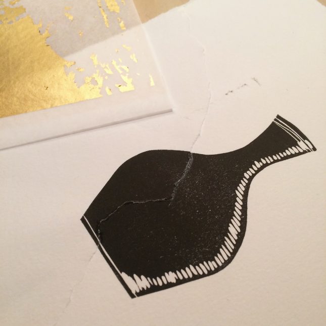
I admit, I freaked myself out a little too.

Next, I attempted to glue it back together with gold leaf. This is where I learned the importance of LETTING THE INK DRY FIRST.

Yeah, that didn’t work. It’s meant to be a fine straight line. As you can see, the gold stuck all over the place including off the print. Fail. Well, this is how we learn.

So, back we go and fortunately I’d made a few attempts at the linocut print, so I could tear even more of them apart! This time, waiting until everything was dry…

Bit more careful with the glue this time..

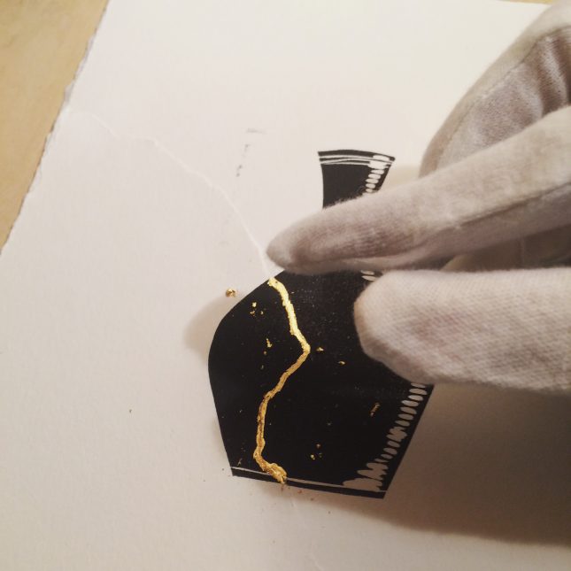
And of course I remembered to wear gloves to avoid tarnishing the gold with my human hand oils 😉

And there you have it.

Kintsukuroi – edition of one.

Linocut print and 23ct gold leaf.

Exhibition details here.

Mixed media – “Room For Growth”

About the exhibition

In 2016 I was invited to be part of an exhibition called Palimpsest, held in The Old Chocolate Factory in Bad Oeyenhausen, Germany.

The exhibition was curated and organised by Katja Rosenberg and Artcatcher with the aim of raising money to support multilingual guided tour for citizens with a migration background.

The theme “Palimpsest” means from old, make new. It also has the practical meaning associated with old drawing and writing materials, where ink etc was scraped from velum to allow it to be re-used.

“In the context of our town and current world, we mean the process of redefining the purpose of a  place in an ever changing world with its changing challenges and opportunities – the essence of the place stays visible, but its thinking has to change with the times.” (Katja Rosenberg, 2016)

As the exhibition was held in a building destined for regeneration by a local architecture firm, this was particularly salient.

All works entered were the same dimensions (30x120cm portrait), and installed hanging from the interior ceiling of the building, allowing visitors to walk between the works. In addition events and dance performances were held around the work during the exhibition.

About the work

“Room for growth”   Ink on rice paper.

Artists statement:

“We construct a building with one original purpose in mind. A generation invests in the maintenance of the building until it falls into disuse, or evolves its usage and meaning for the next generation.

In this work, we see a building which has multiple simultaneous uses, with inhabitants finding many ways to benefit from the structure. This building is a hive of activity – representing the ever-changing ecology of a building as well as the dual influence of both man and nature.

The artwork is constructed of layers of rice paper and maps of the Bad Oeyenhausen area containing the old Schokoladenfabrik building, which are visible beneath.”

About the process

For this piece I was inspired by the format (120cm portrait), the location and the concept of Palimpsest – which aligned with my ongoing interest in architecture and the relationship between people and the buildings they inhabit, particularly when those uses and facades change and grow together.

With the requirement for a long work, I wanted to work with a continuous sheet of paper of an appropriate size. I also wanted to include a map of the local area in which the exhibition and the tours would be held.

Therefore I combined a long sheet of rice paper with maps of Bad Oeyenhausen to allow both to be shown without impacting on the surface work itself.

It was also particularly relevant as I had recently been exploring cartography as art and drawing, as part of my studio work.

First, I had to test my hypothesis that by drawing on rice paper, enough of the map would be visible beneath


I created some practice drawings using Derwent Grafik pens as an initial experiment.

It actually created a nice balance with the relative opacity of the paper, so that there was an impression of the map behind, without obscuring or over-complicating the illustration on top.

When working with the rice paper, I soon realised two things.

  1. You cannot use pencil. Or at least, you cannot erase pencil, as it destroys the paper. Therefore you need to draw in ink first time, and you have to get it right.
  2. The ink bleeds massively into the paper, especially if your drawing uses slow and methodical marks, rather than broad light gestures. So whereas on standard drawing paper I might use Derwent Grafik pens to provide a little more movement and fluidity (because my lines are slow and methodical and can look a little rigid), when working with rice paper I needed to use drawing pens with more control.


Note: for more info on these differences between drawing pens, check out my very very long materials review on the Jacksons Art Supplies blog

Here you can see how I experimented with different pen sizes for different features in the architecture, working out which nib size of which drawing pen brand I would need to replicate the effect I’d expect on standard drawing paper.

In the end I settled on a combination of Unipin and Sakura Micron Pigment markers of various sizes, and used this as a constant guide as I developed the final work.

In order to work at this size, and fully understand the dimensions with which I was working, I pinned the full length map to a roll of fabriano drawing paper and taped it to my studio wall.

And because, as previously established, I only had one shot to draw this directly in ink, I basically had to pre-draw the framework on an identically sized piece of paper and copy across.

Here’s the final work.


Linocut – DFL

DfL h locke

DfL (Down from London) is a limited edition linoprint I created for a series of exhibitions in Margate in summer/autumn 2016.

It was a good test of my linoprint skills – which compared to the control I feel when I pick up a pen – are virtually non-existent.

Credit for the final result must go partially to advice from such sage experts as Martin Adams and Kirsten Schmidt (expert East London Printmakers) and Margate-based Nick Morely of Hello Print. Incidentally, if you want a superb book on linoprint for artists, you could do worse than grab a copy of Nick’s book.

As with all good things, I started with a drawing..

DfL h locke

Please note the wooden spoon – turns out that’s the most important part of the whole process. It’s all about the pressure baby, especially when you’re hand-printing lino.

For this edition, as you can see, I used Jacksons Water-based ink. This is a lot easier to clean up after, but as I’ll cover in other posts, for some editions I use Caligo especially when printing by hand.

DfL h locke

To cut the plate I used Pfeil tools. To be fair, they are the only ones I use or would consider – just so much control and such high quality. They’re pricey but 100% worth it – the best price I’ve found is at Jacksons.

DfL H locke

I love the way plates look when they’re freshly inked. So much potential (but also potential for it to go wrong… 😮 )

DfL H locke

DfL H locke

Here’s what happens when you don’t use enough spoon… sob.

DfL H locke

Here’s the first colour plate going on – with enough pressure! Thanks to my experts for the tips and I can confirm that the only way to hand print lino is essentially by applying pressure until you have worked up quite a sweat and creating one massive bicep. Maybe I shouldn’t have made this edition in the middle of a hot summer..

DfL H lockeThe first reveal of the second (black) plate… thank gawd I didn’t mess that bit up.

DfL h locke

Edition of 10 completed and suspended – it’s always quite satisfying to see them strung across the studio.

DfL H locke

DfL H locke

And I got to show them off at the Viking Gallery in Cliftonville, Margate.

I’ve also made a series of greetings cards based on this work, which are available in my etsy store.

Exhibition: Misbehaviour, Redruth & Mile End


misbehaviour_redruth

I’m in a new international exhibition in Redruth, Cornwall.

“Misbehaviour” (curated by Art Catcher and the ever amazing Katja Rosenberg) opens at CMR Gallery Redruth on 8th October until 29th October and includes artists from the UK and beyond. The full catalogue is available as PDF download here.

My piece for the exhibition is entitled “Scrumping” and is about the fine Devon & Cornwall tradition of.. ahem.. nicking apples from other peoples’ orchards. (NB. Not recommended. Very naughty).

Ink on paper, hand-gilded with 23ct gold leaf.

This slideshow requires JavaScript.

Last night Misbehaviour came to London. The exhibition I was in at the end of last year has relocated to the Art Pavillion in Mile End and opened with the private view last night.

IMG_0819

The show, curated by Katja Rosenberg of Art Catcher will also include a series of workshops and events between now and 22nd Feb. Details on the website.

7436580

Here are some photos from a very busy private view…

IMG_0820

IMG_0822

IMG_0823

IMG_0824
there it is…


IMG_0825

IMG_0826

IMG_0827


IMG_0829

IMG_0834


And there are a load more photos being uploaded onto the event’s Facebook page.